states <- map_data("state")
ggplot(states, aes(x=long, y=lat, group=group)) +
    geom_polygon(color="gold2", fill="navyblue")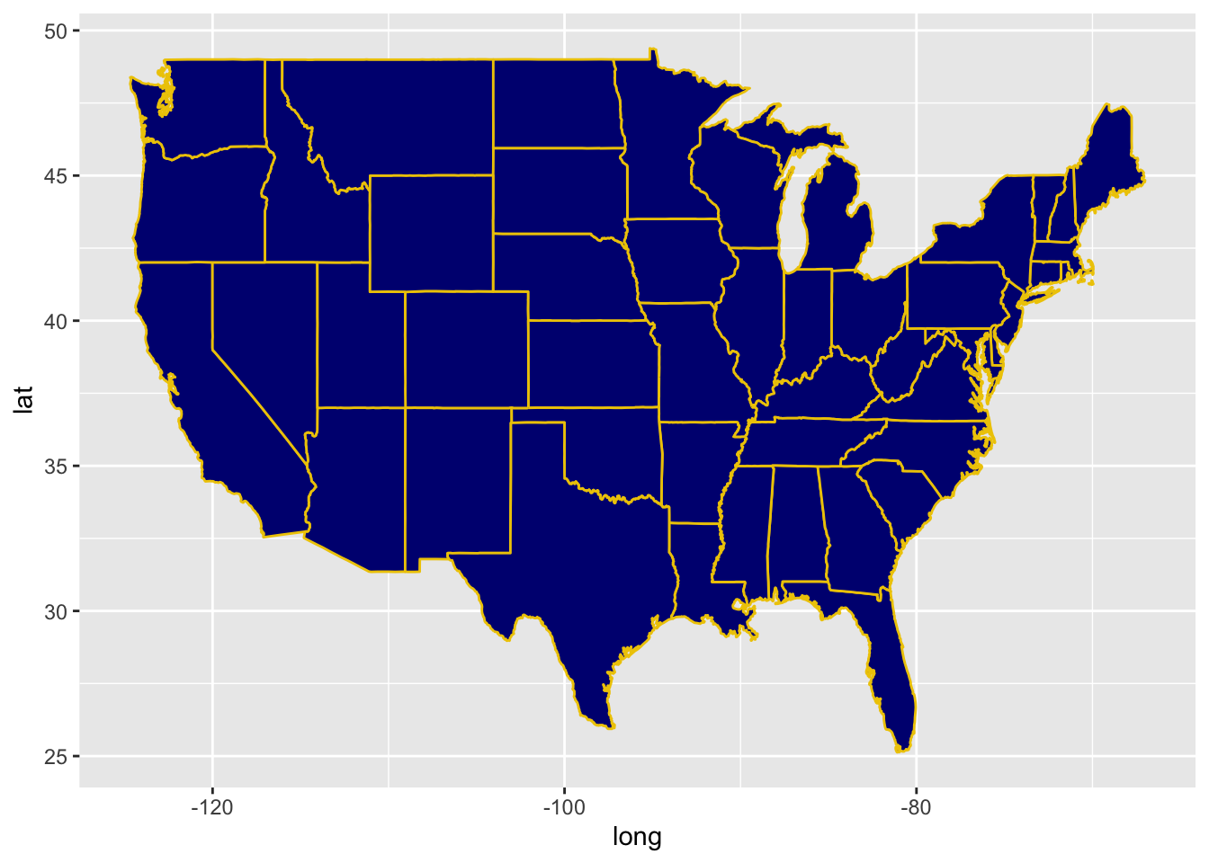
states <- map_data("state")
ggplot(states, aes(x=long, y=lat, group=group)) +
    geom_polygon(color="gold2", fill="navyblue")
Edit the code so that each state is a different color
states <- map_data("state")
ggplot(states, aes(x=long, y=lat, group=group)) +
geom_polygon(color="gold2", fill="navyblue")
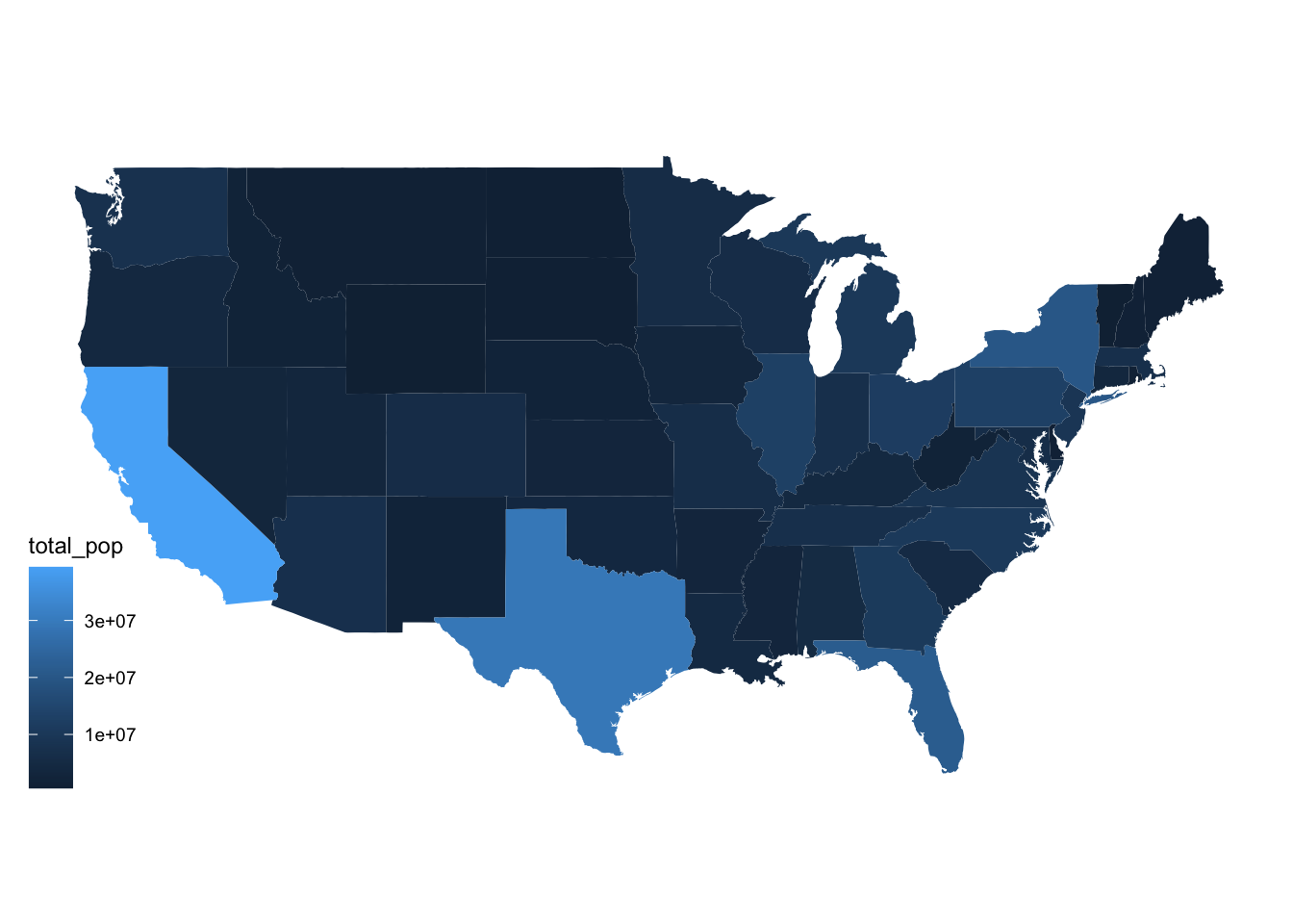
Your task is to use the American Community Survey data to make a chloropleth map of the US
You should:
acs_state_data = read_csv("acs_state_data_2022_5y.csv")
acs_state_data$state = tolower(acs_state_data$NAME)
Variable information:
med_age: median agemed_income: median agerace_X: estimated population of (self-reported) raceborn_in_state: estimated population who were born in stateX_age_married: average age at first marriage for self-reported male and female respondentshs_diploma, associate_degree, prof_degree, etc.: estimated number with a high school diploma, associate’s degree, professional degree, etc.internet_X: estimated number of people who have internet servicesImportant note: we’re using geom_map as a shortcut here to make a chloropleth map. This saves us the step of encoding the lat/long borders of states, and lets us directly fill the state colors using acs_state_data only. If you’re asked to make a chloropleth map with data that only includes, e.g., state name, use this starter code.
ggplot(data = acs_state_data) +
  geom_map(
    aes(map_id = state, fill = total_pop),
    map = states
  ) +
  expand_limits(x = states$long, y = states$lat) +
  coord_map() +
  theme_map()