Plot design
Day 04
Polishing plots

We’re not quite satisfied….
- I want the bars to have a border that stands out
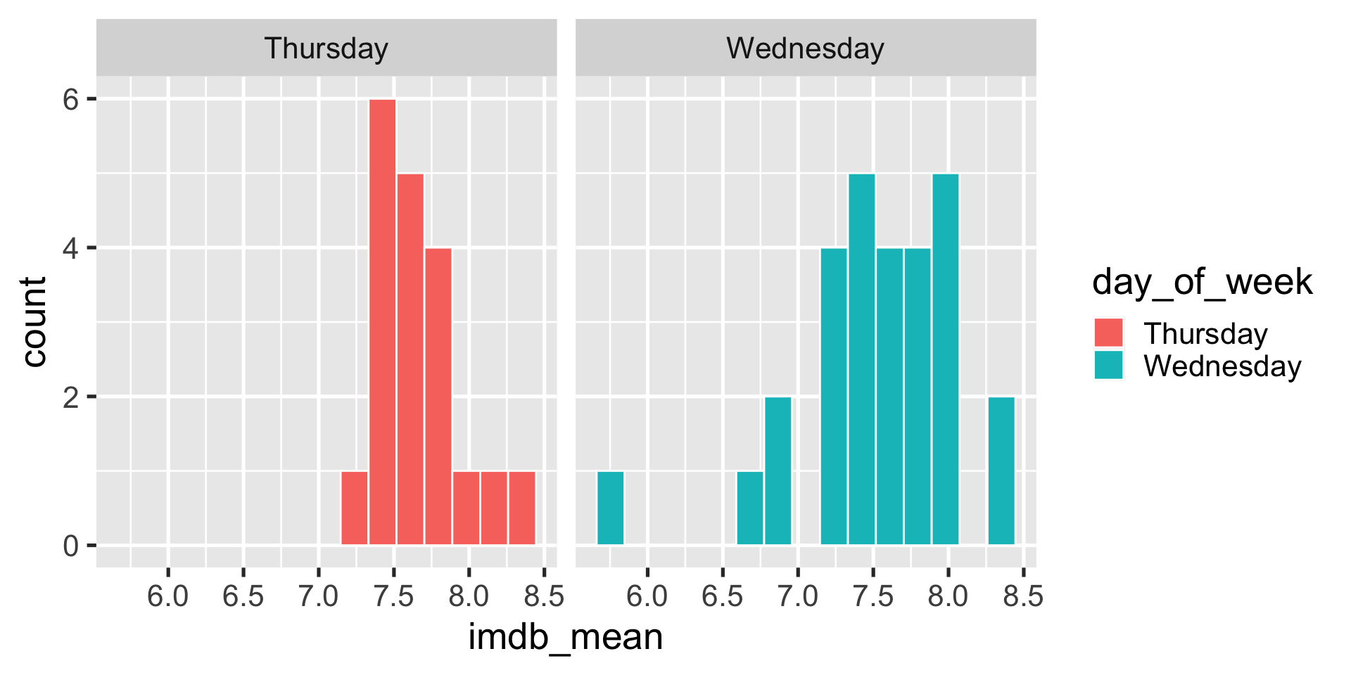
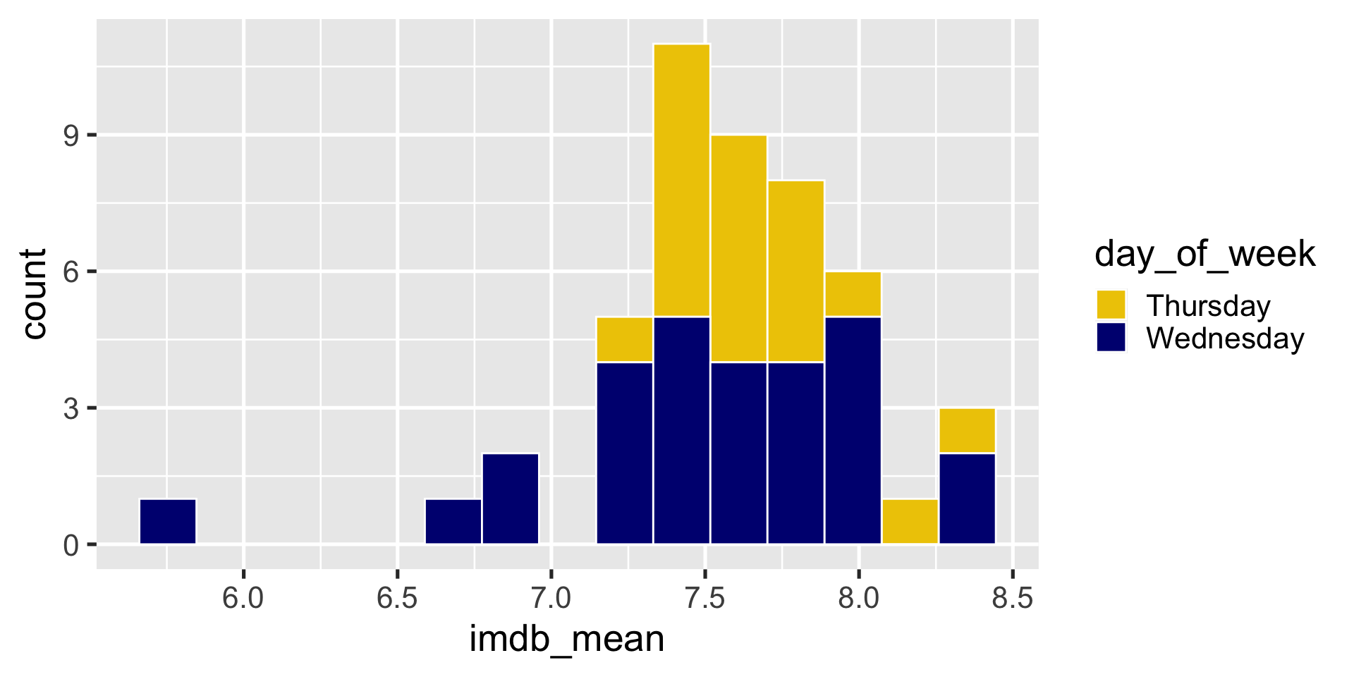
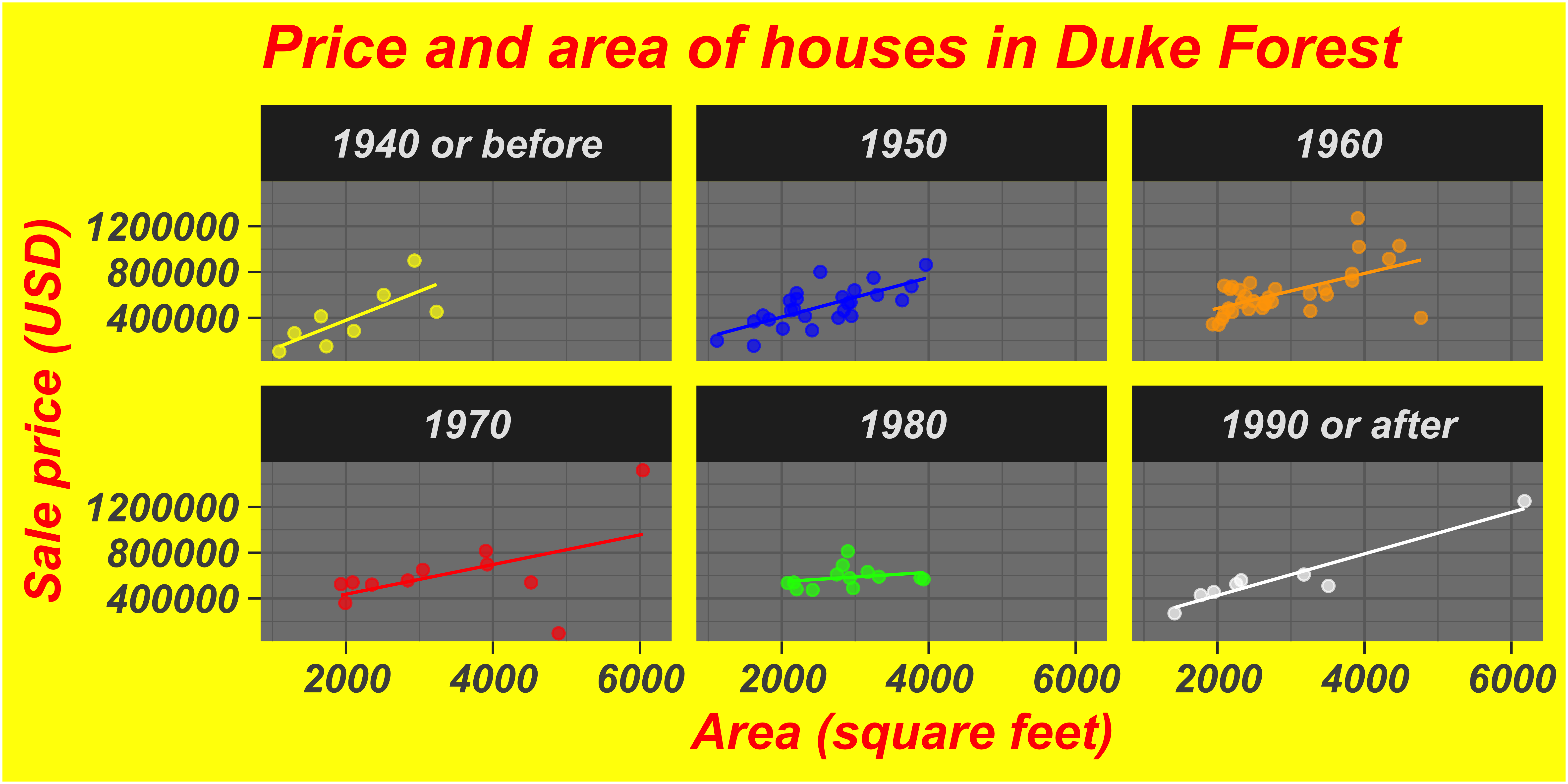
- Let’s try a facetted graph
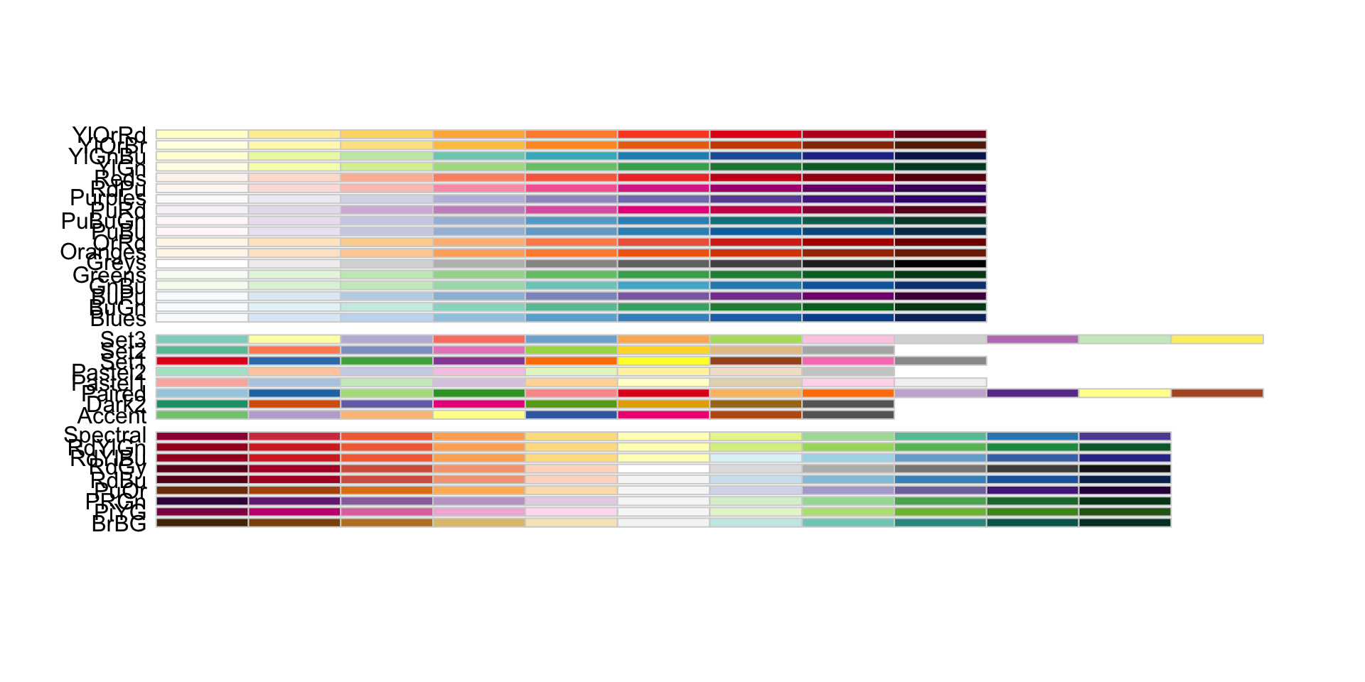
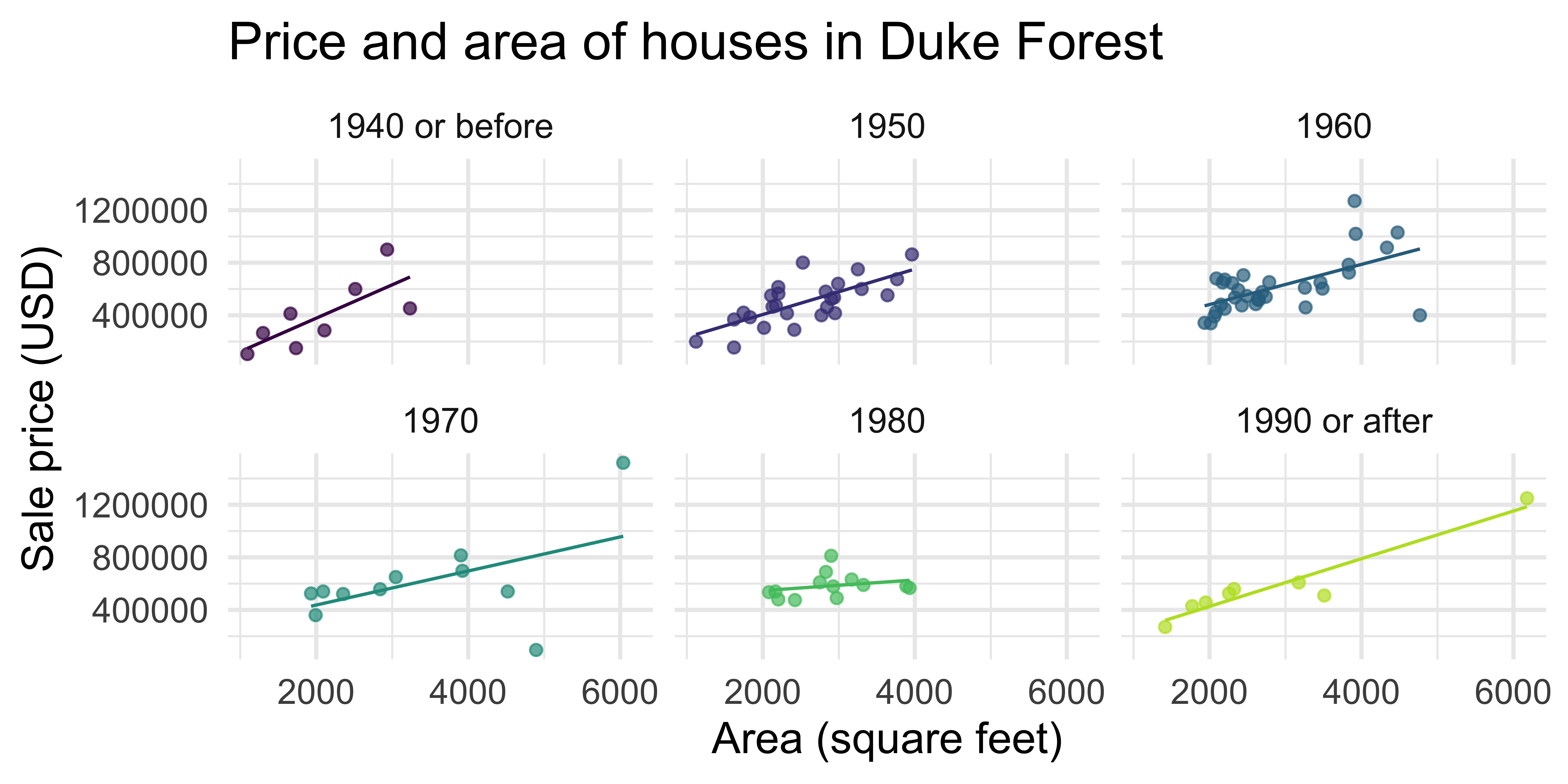
- I don’t like the default color scheme
- I don’t like the gray background
Setting aesthetics
Setting = choosing a certain value for an aesthetic
Facets
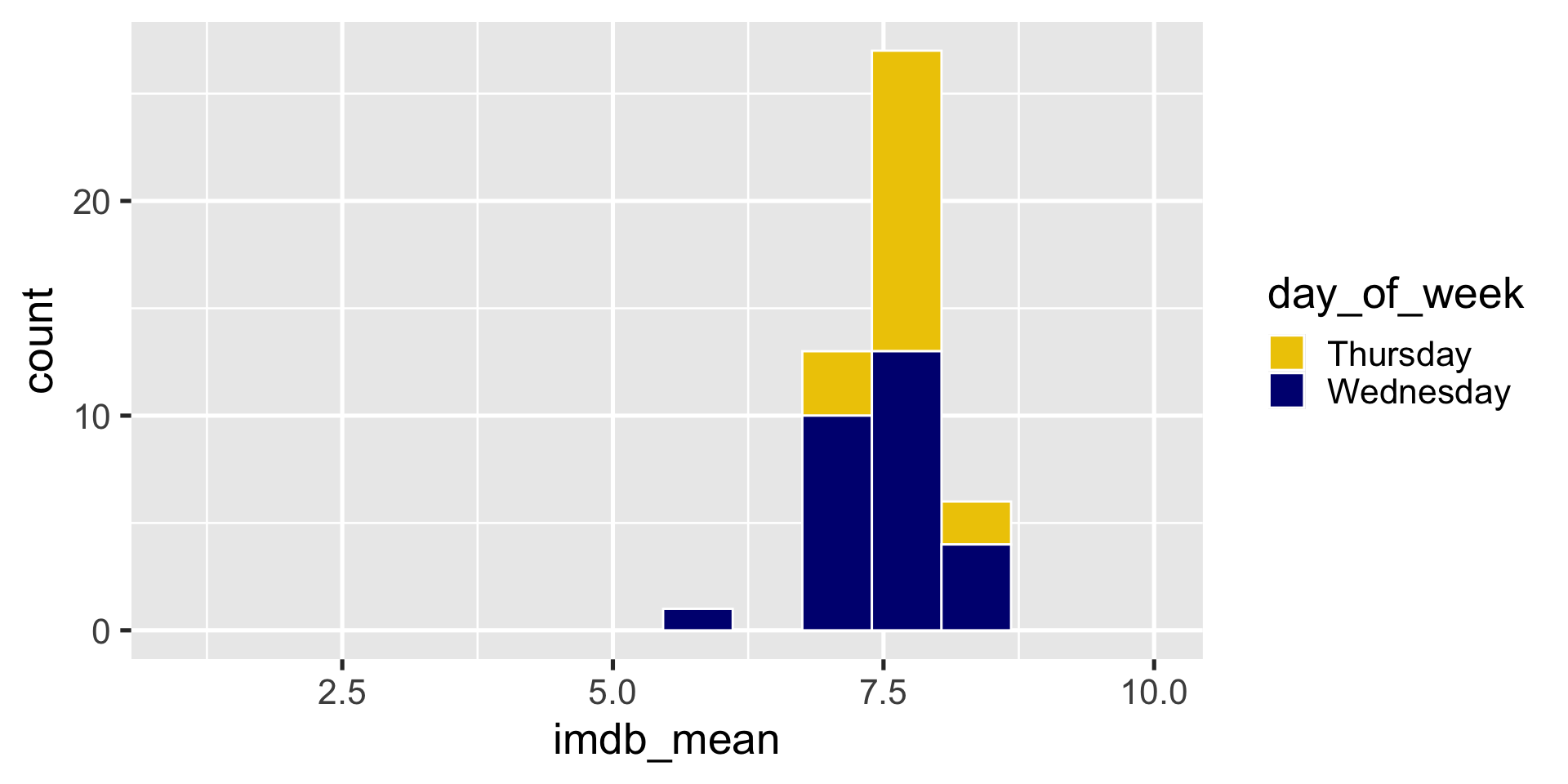
Example (built-in scale)
Example (built-in scale)
Example (built-in scale)
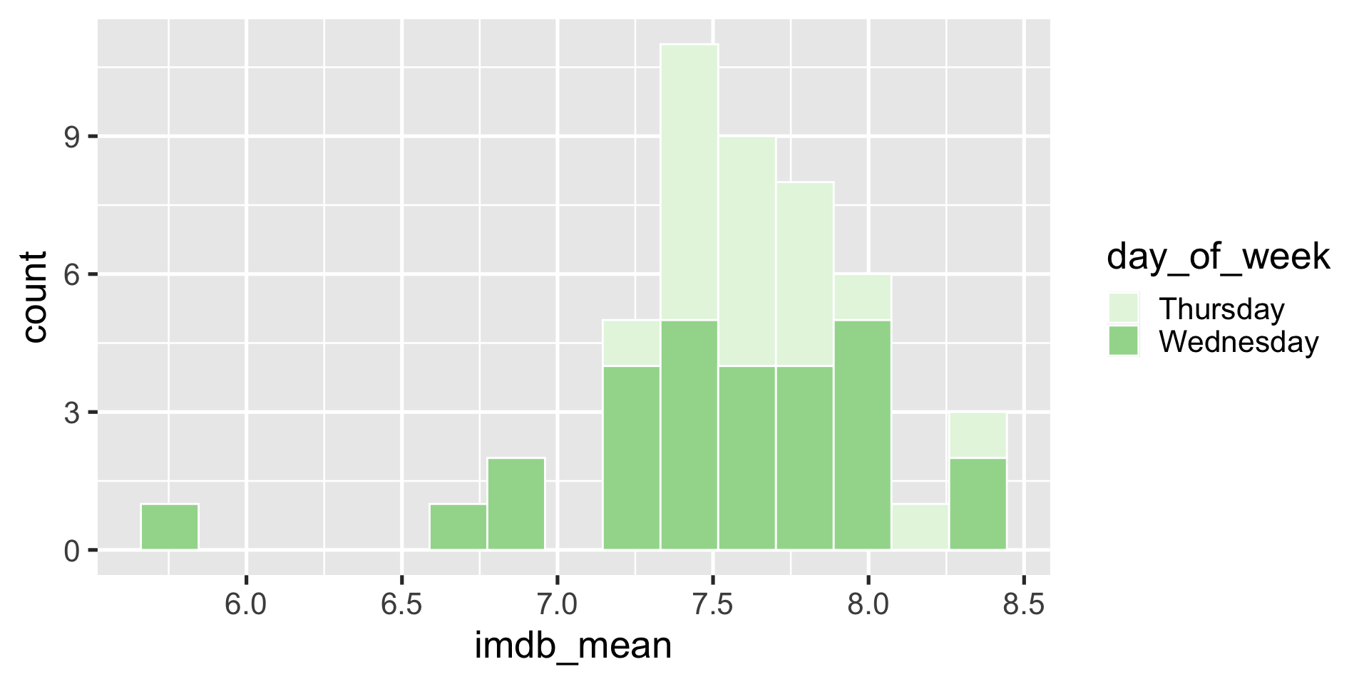
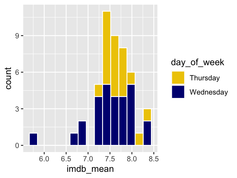
Example (manual color palette)
Let’s make Wednesdays navyblue and Thursdays gold2
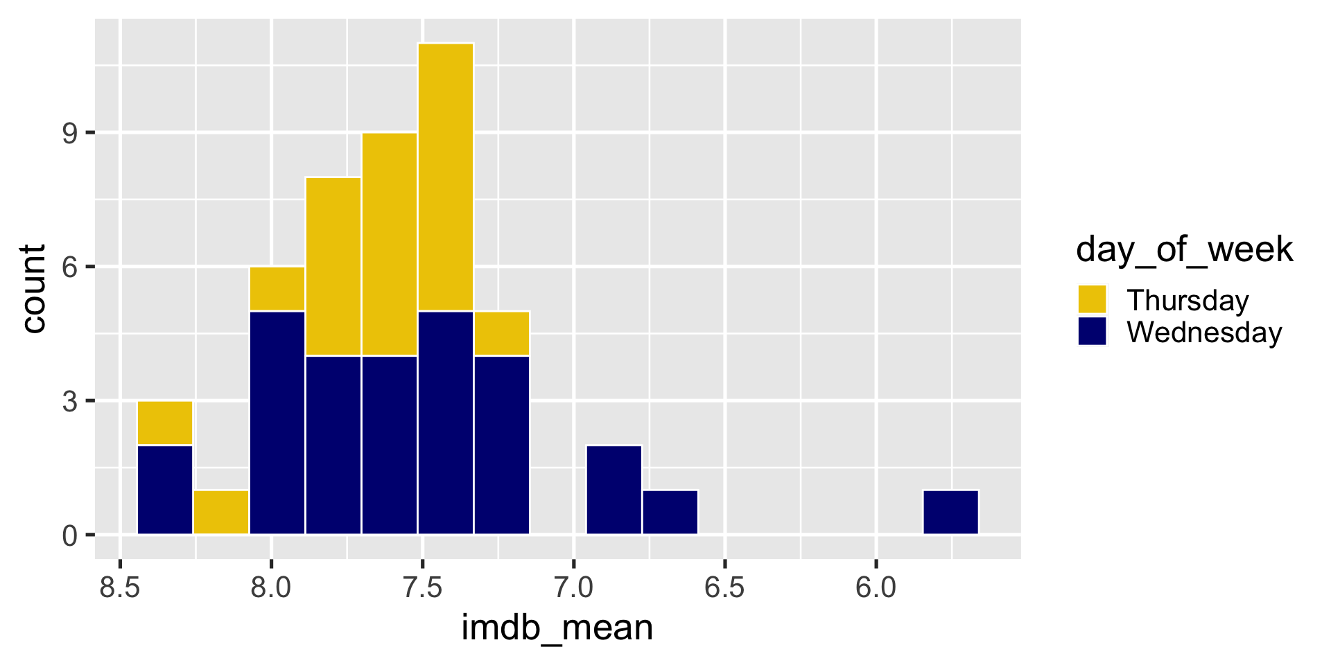
Can also change non-color scales
Can also change non-color scales
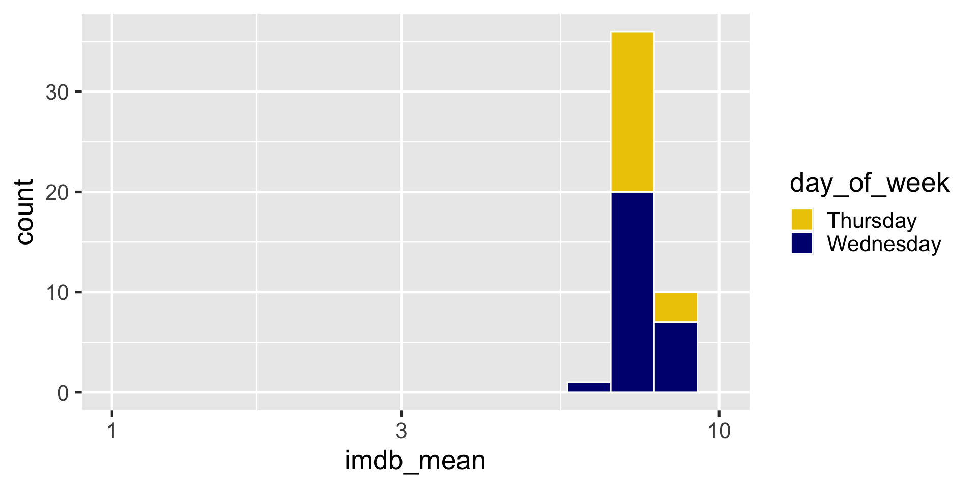
Can also change non-color scales
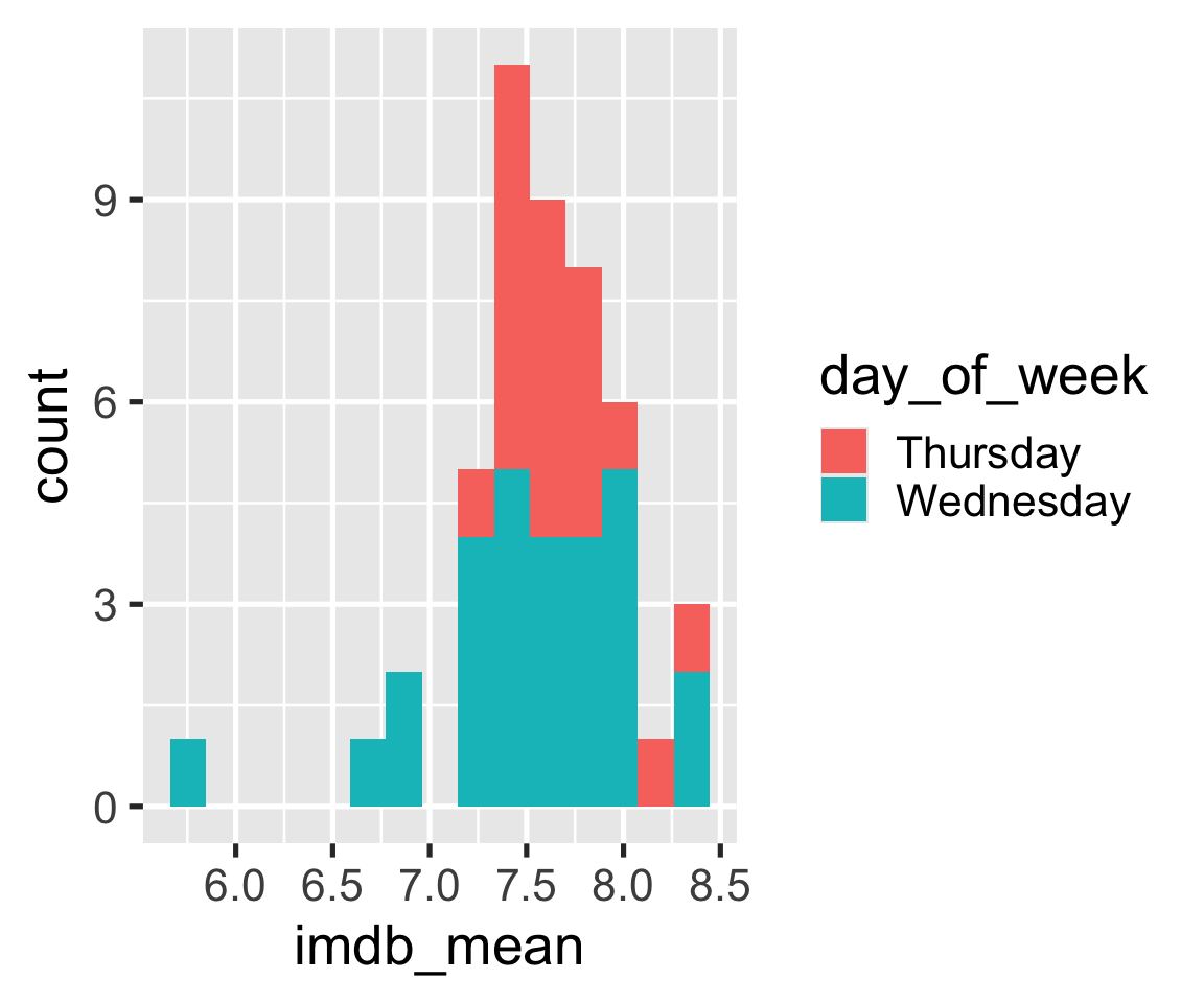
Changing Themes
Theme: The non-data ink on your plots
- background
- tick marks
- grid lines
- font
- legend position
- legend appearance
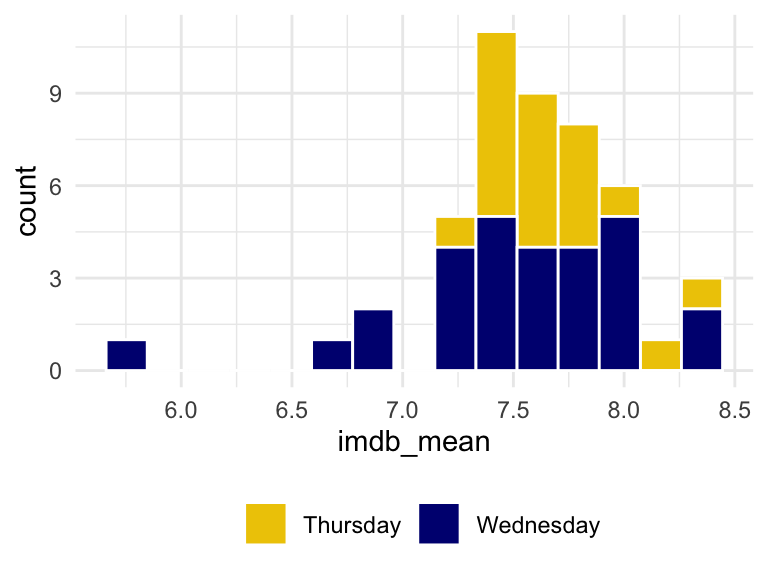
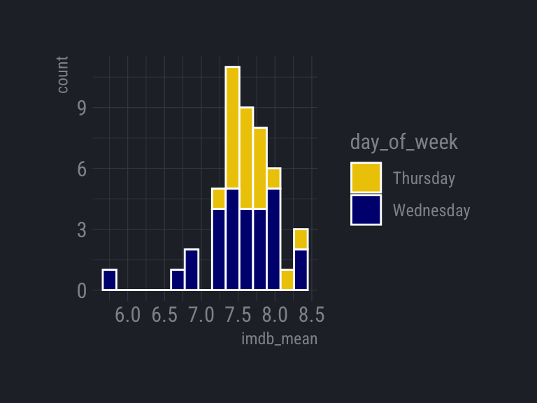
Try it
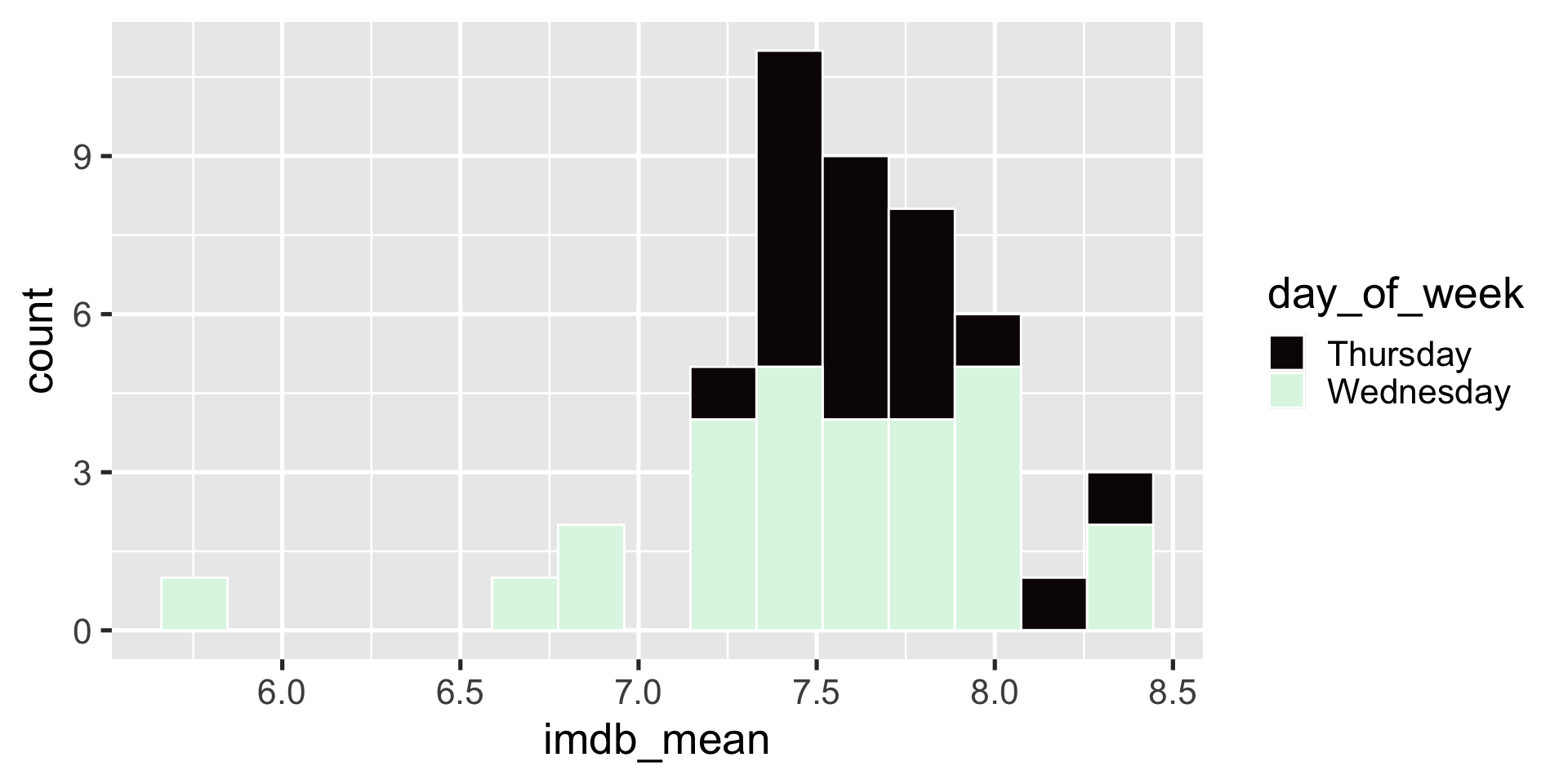
Apply theme_light() to the histogram
00:30
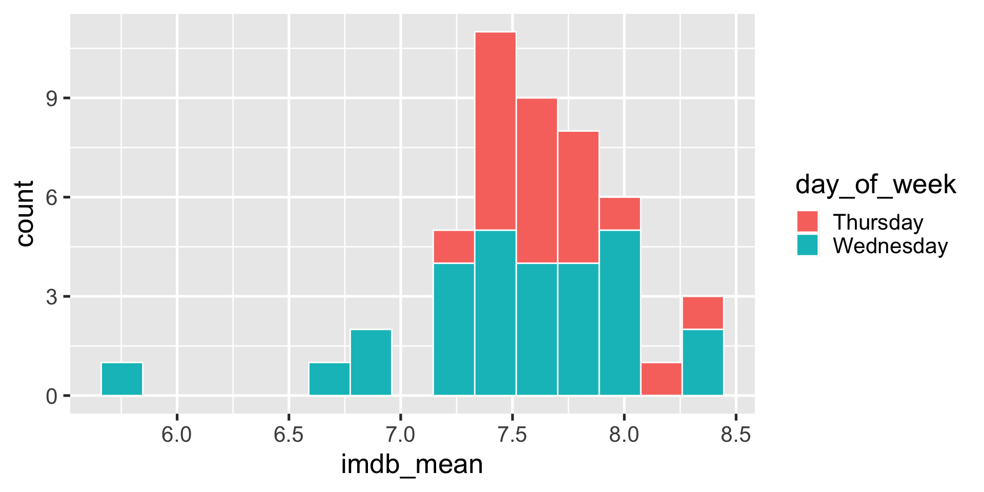
Move legend and make the background transparent
Clean up labels and title
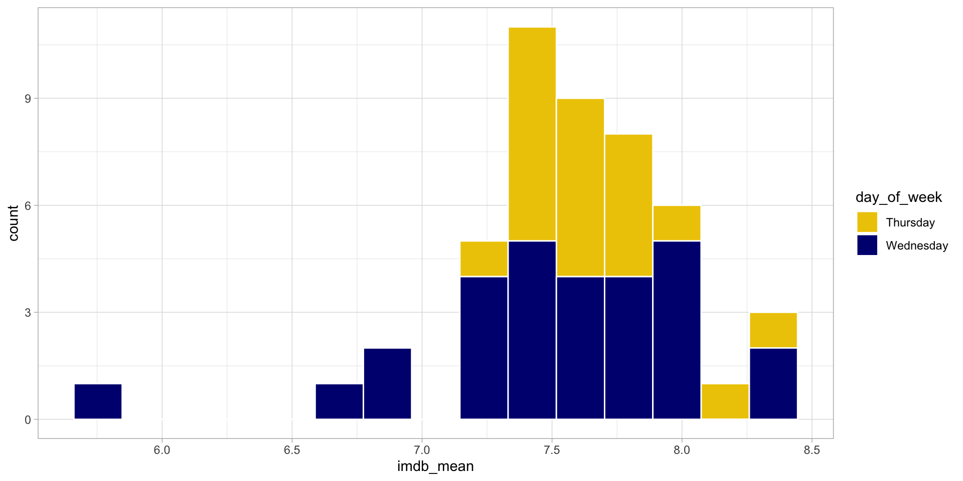
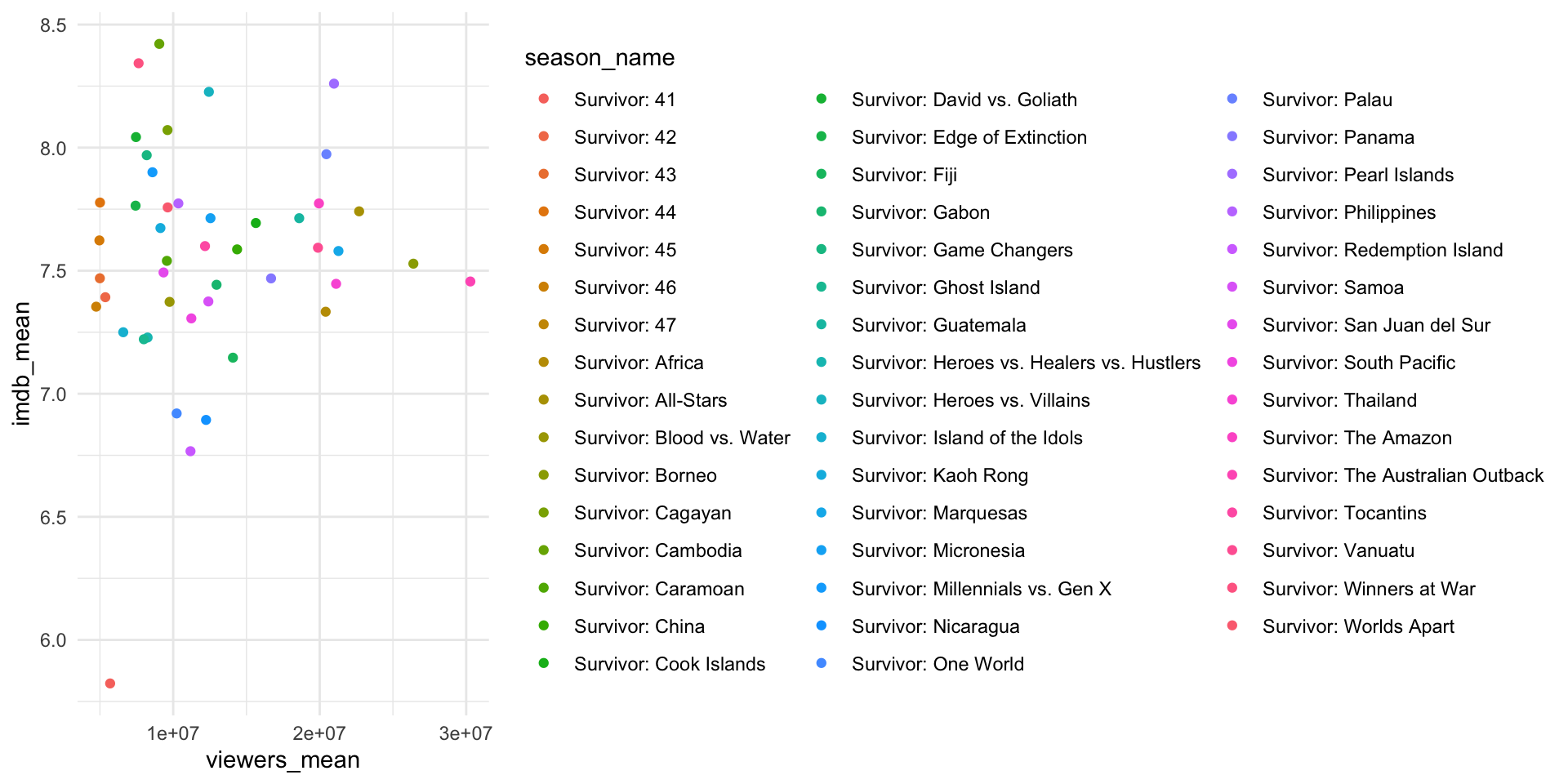
ggplot(season_summary) +
  geom_histogram(
    aes(x = imdb_mean, fill = day_of_week),
    bins = 15,
    color = "white"
) +
scale_fill_manual(values = c("gold2", "navyblue")) +
theme_minimal() +
theme(
legend.position = c(.15, .85),
legend.background = element_blank()
) +
labs(
x = "Season Average IMDB Rating",
y = "",
fill = "",
title = "Survivor is better on Thursdays"
)
Remove minor gridlines
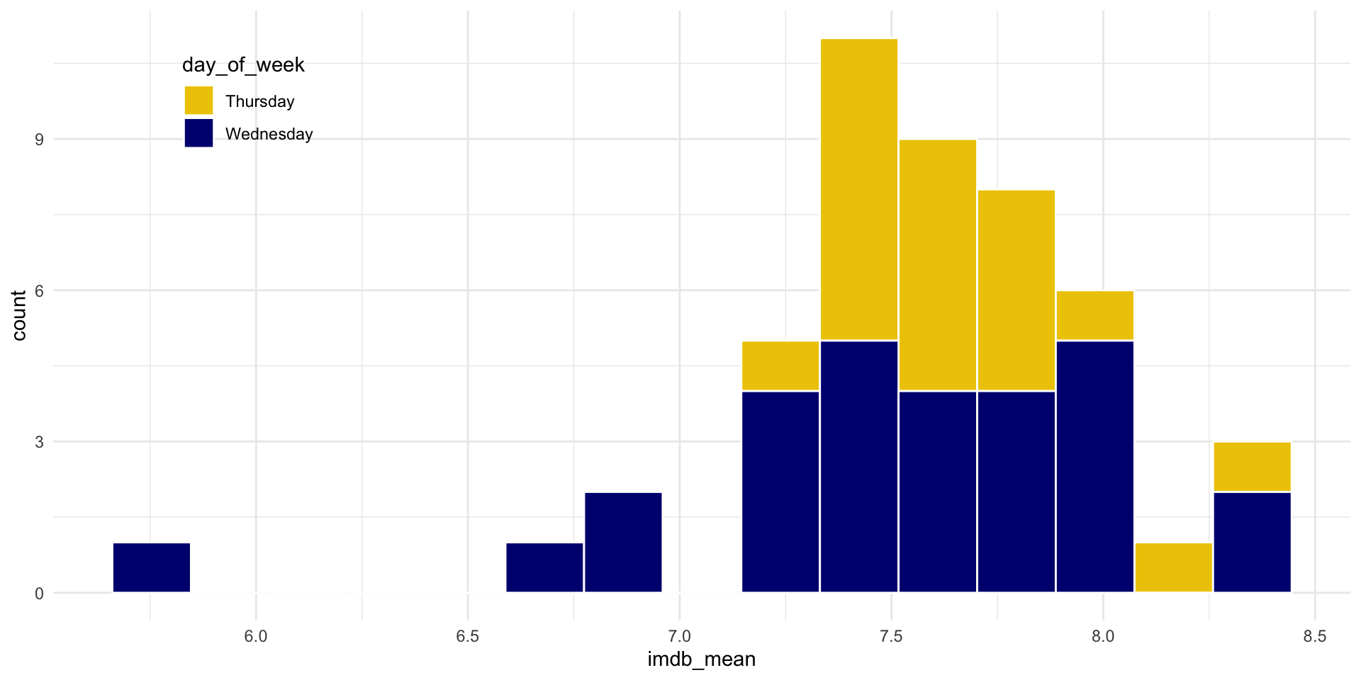
ggplot(season_summary) +
  geom_histogram(
    aes(x = imdb_mean, fill = day_of_week),
    bins = 15,
    color = "white"
    ) +
scale_fill_manual(values = c("gold2", "navyblue")) +
theme_minimal() +
theme(
legend.position = c(.15, .85),
legend.background = element_blank(),
panel.grid.minor = element_blank()
) +
labs(
x = "Season Average IMDB Rating",
y = "",
fill = "",
title = "Survivor is better on Thursdays"
)
Get rid of .5’s
ggplot(season_summary) +
  geom_histogram(
    aes(x = imdb_mean, fill = day_of_week),
    bins = 15,
    color = "white"
    ) +
  scale_fill_manual(values = c("gold2", "navyblue")) +
  scale_x_continuous(breaks = c(6, 7, 8, 9)) +
  theme_minimal() +
  theme(
    legend.position = c(.15, .85),
    legend.background = element_blank(),
    panel.grid.minor = element_blank()
  ) +
  labs(
    x = "Season Average IMDB Rating",
    y = "",
    fill = "",
    title = "Survivor is better on Thursdays"
  )
Add an annotation
ggplot(season_summary) +
  geom_histogram(
    aes(x = imdb_mean, fill = day_of_week),
    bins = 15,
    color = "white"
    ) +
  scale_fill_manual(values = c("gold2", "navyblue")) +
  scale_x_continuous(breaks = c(6, 7, 8, 9)) +
  theme_minimal() +
  theme(
    legend.position = c(.15, .85),
    legend.background = element_blank(),
    panel.grid.minor = element_blank()
  ) +
  labs(
    x = "Season Average IMDB Rating",
    y = "",
    fill = "",
    title = "Survivor is better on Thursdays"
  ) +
  annotate("text",
           x = 6,
           y = 3,
           label = "Lowest ratings \n occur on \n Wednesdays",
           col = "navyblue")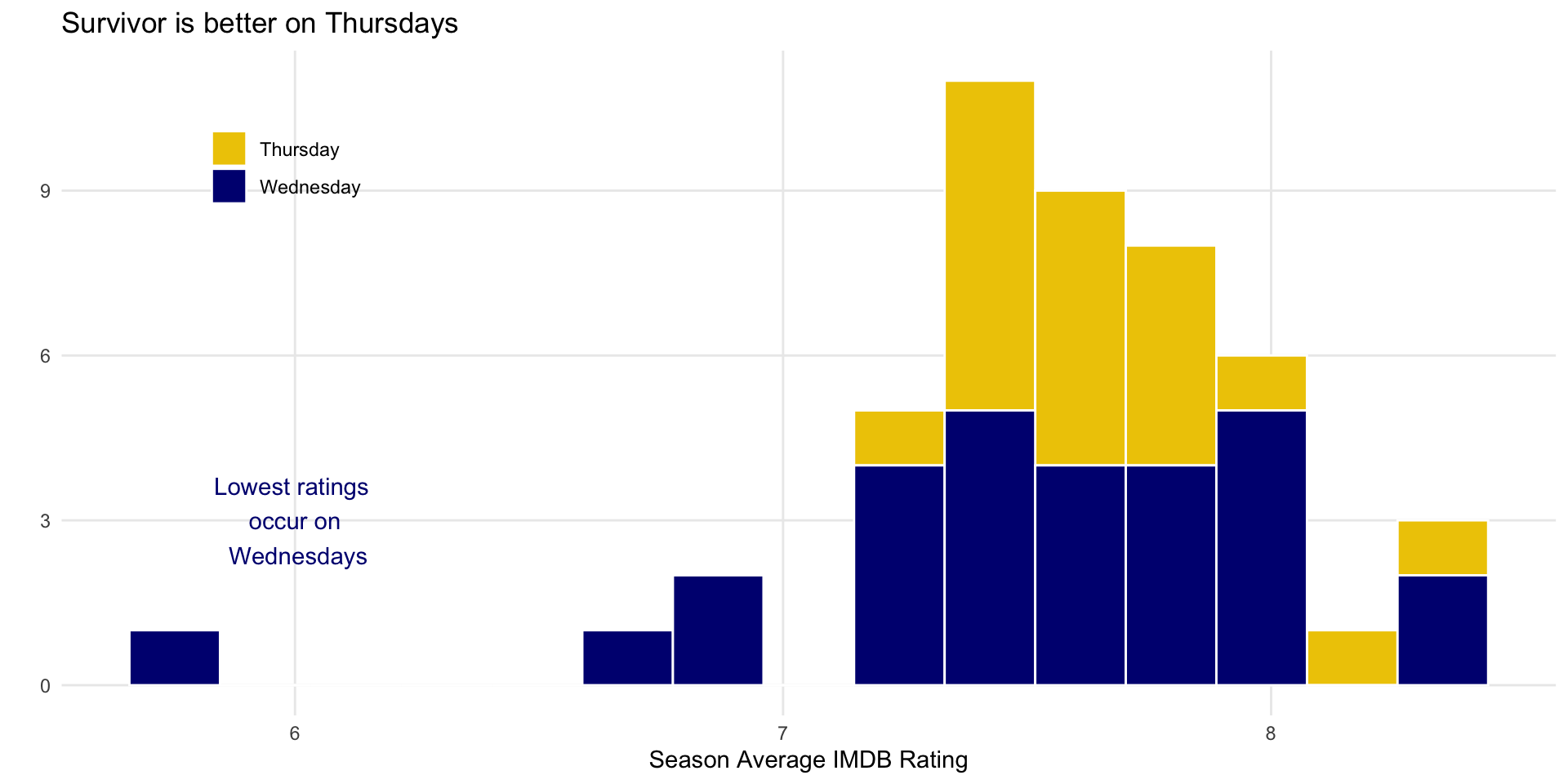
Which do you prefer?
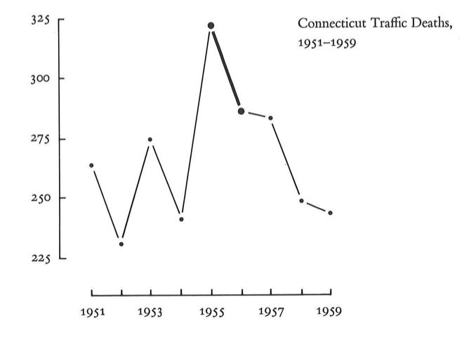
Show the data, don’t distort it
Show the data, don’t distort it
What a huge effect! 
But it isn’t the whole story
Choose the right plot
Wilke has good suggestions in chapters 5-16
Always stop and think about how easy it is to see the story
Try a few different options
![]()
Example: Which slice is the biggest/smallest?
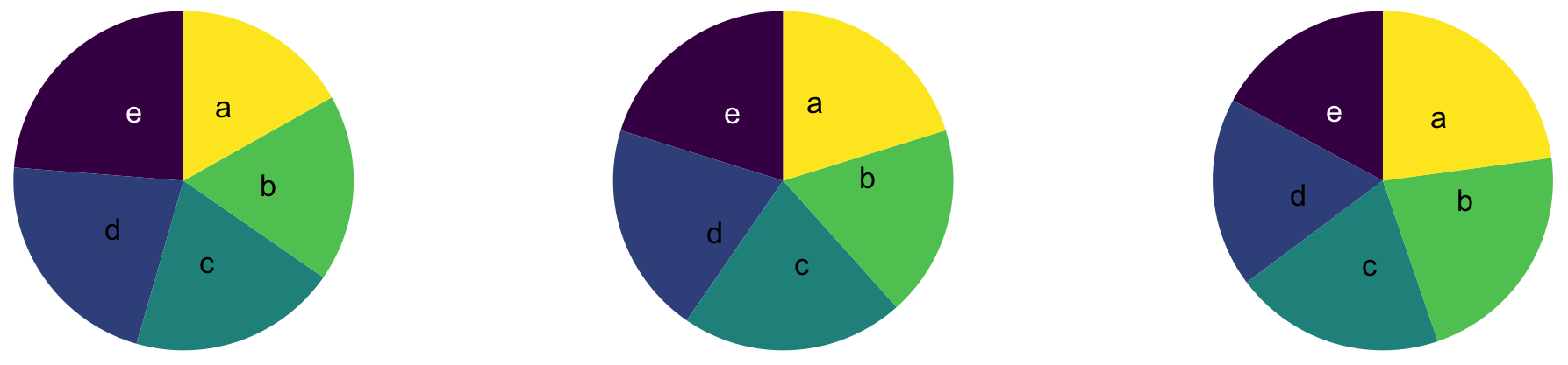
00:30

Use color meaningfully and with restraint
Use color meaningfully and with restraint
Tell a story
One way to do this is by highlighting the important parts
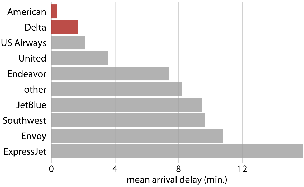
Leave out non-story details
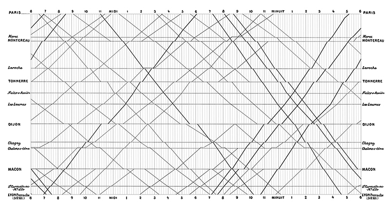
Is this train schedule easy to read?
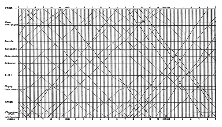
Avoid distractions
Does removing gridlines make it somewhat easier?
Data visualizations have an aura of objectivity
“We focus on four conventions which imbue visualisations with a sense of objectivity, transparency and facticity. These include: a) two-dimensional viewpoints; b) clean layouts; c) geometric shapes and lines; d) the inclusion of data sources.”
Good graphs can also break these guidelines
Good graphs can also break these guidelines