| date | last_name | first_name | address | age | cause_of_death |
|---|---|---|---|---|---|
| Aug 31, 1854 | Jones | Thomas | 26 Broad St. | 37 | cholera |
| Aug 31, 1854 | Jones | Mary | 26 Broad St. | 11 | cholera |
| Sept 1, 1854 | Warwick | Martin | 14 Broad St. | 23 | cholera |
Intro to Maps
and Spatial
Data
Day 05

What makes “address” a useful variable is that it is linked to a specific location in the physical world. If we plot these addresses, we get something like the following:

While we can see patterns in the last plot, the underlying map of the London streets provides helpful context that makes it more intelligble:
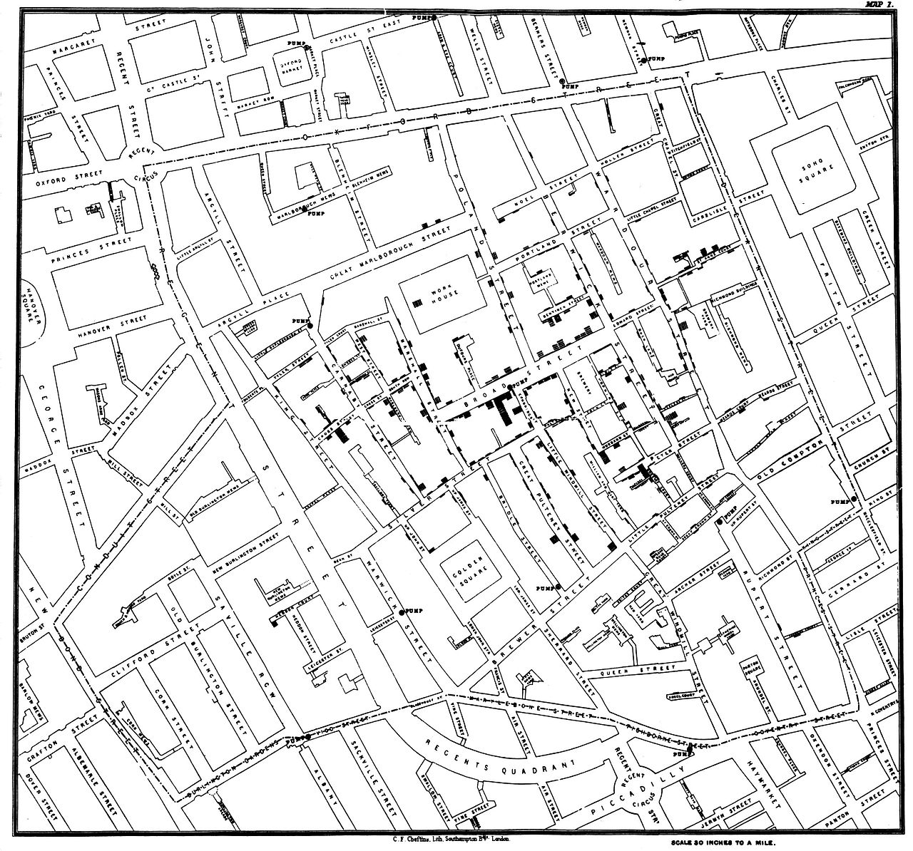
Snow’s insight was driven by another set of data—the locations of the street-side water pumps (it’s kind of hard to see, but they are labelled on the map). Nearly all of the cases were clustered around a single pump on the center of Broad Street.
John Snow’s map (and water pump) are now “famous” among epidemiologists and statisticians.

Chloropleth
Fill in regions with variable values
Need two data sources:
- map data with lat, long, region
- data with measurements for each region
you don’t need to join them!

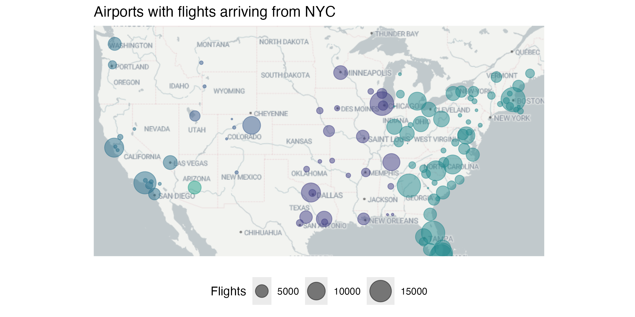
Proportional Symbol
Overlay symbols on an existing map, where the size of the shape is proportional to the variable
Cartogram
Use approximate geographical position to encode information, but not lat/long directly
What is a map?
A bunch of latitude longitude points…

What is a map?
… that are connected with lines in a very specific order.

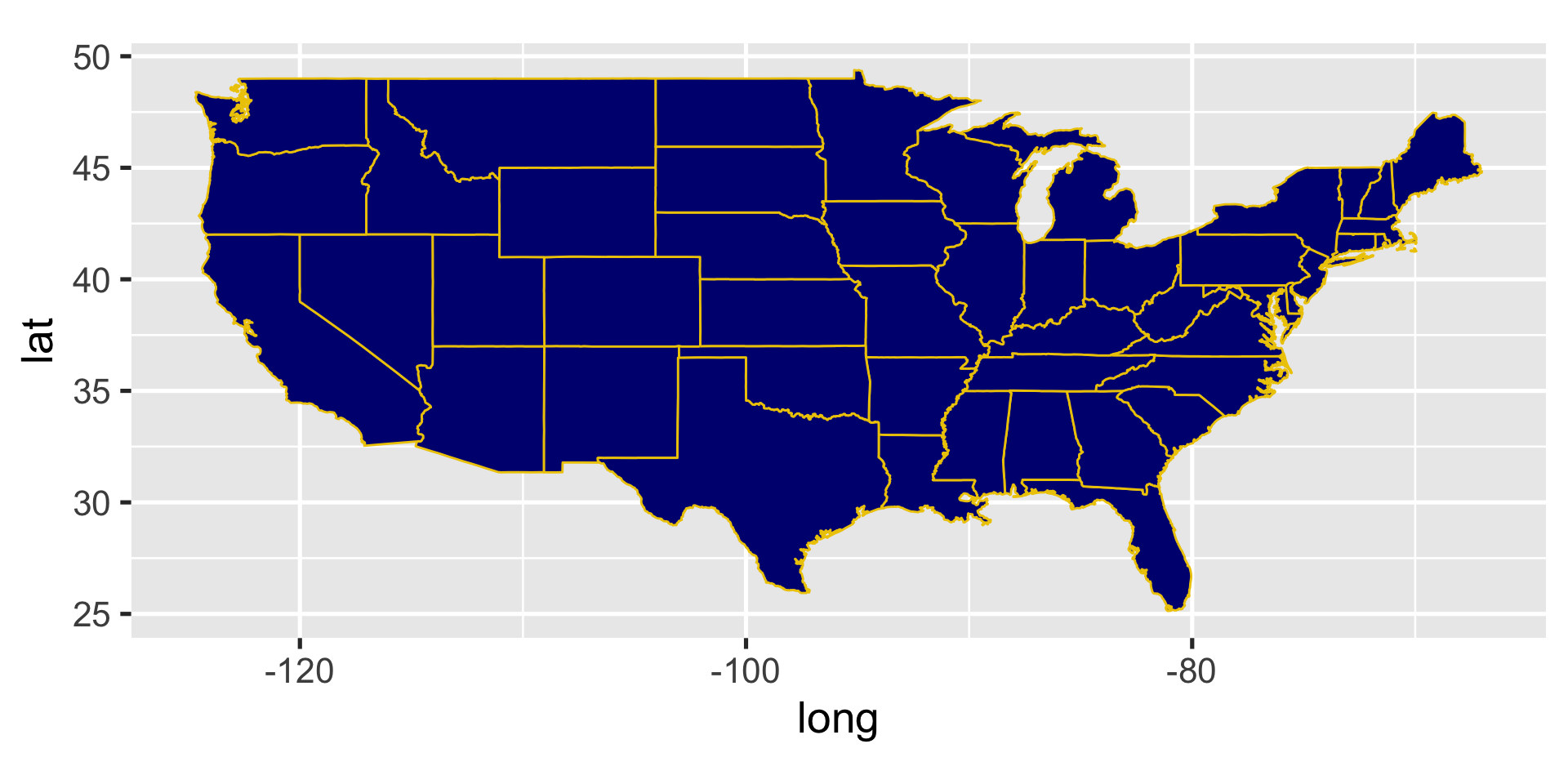
Using geom_polygon()
Using geom_polygon() will treat states as solid shapes, making it easier to add color
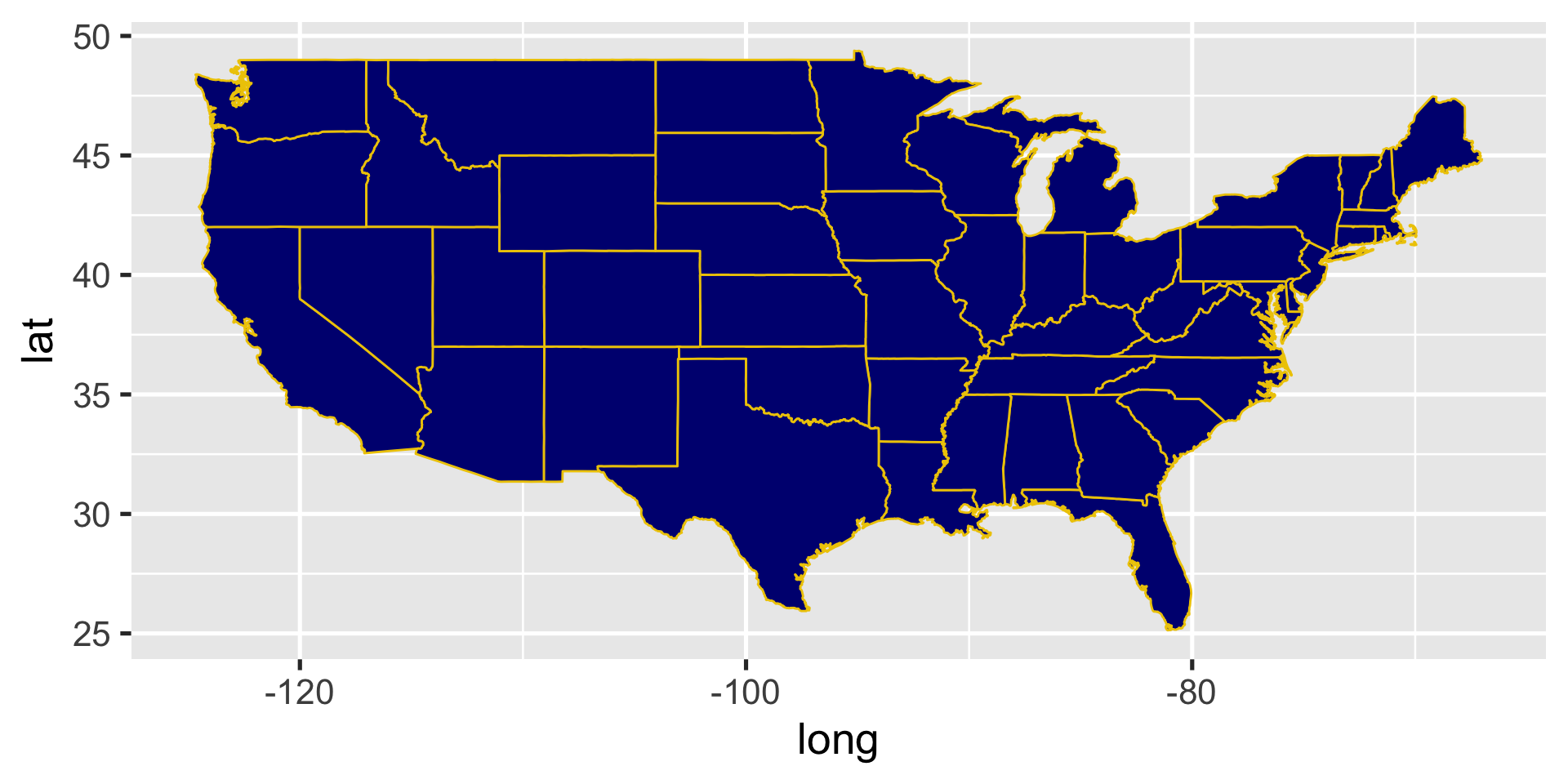
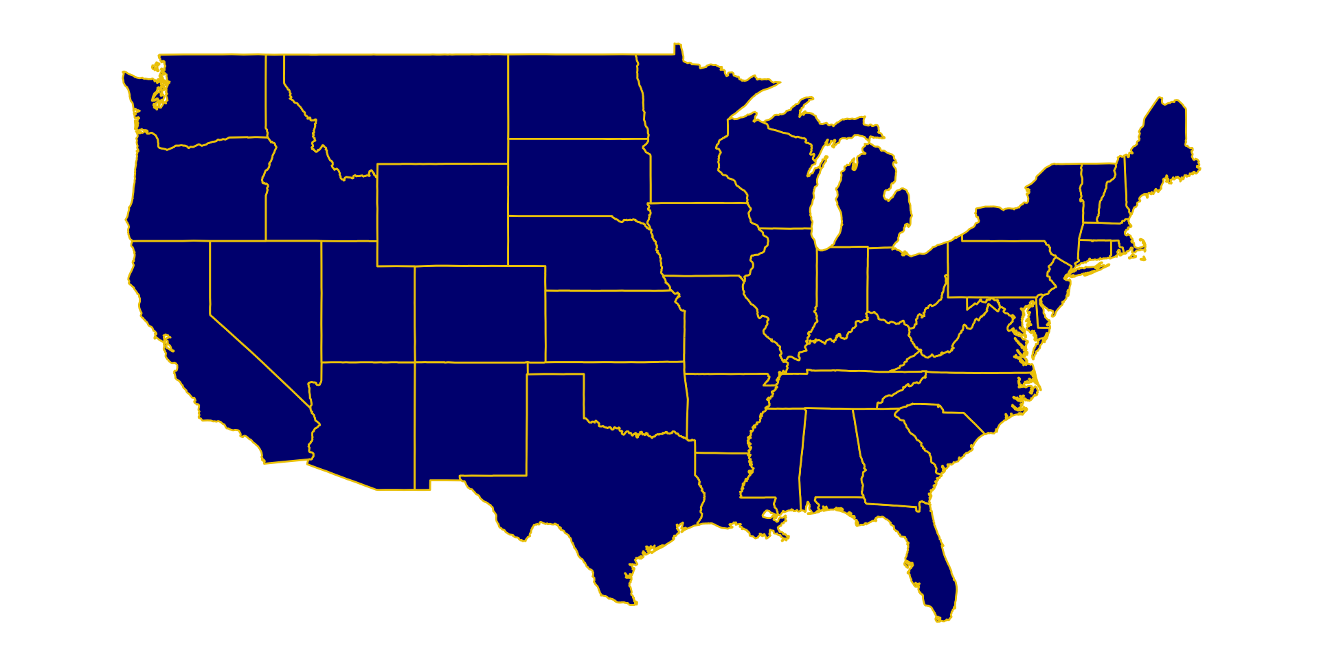
Using coord_fixed()
Using coord_fixed() forces x and y units to be equal
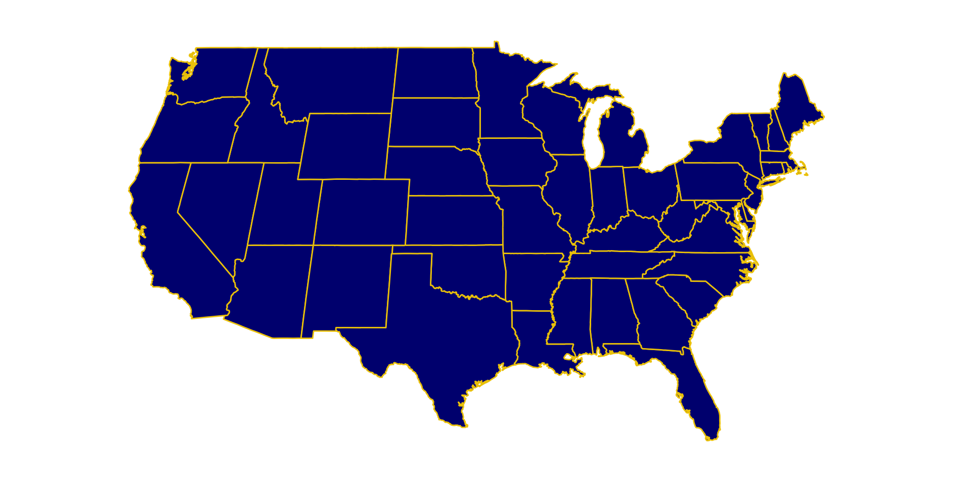
Changing the coordinate system
coord_map function provides a Mercator projection (mapproj package has more options)
Changing the coordinate system
coord_map function provides a Mercator projection (mapproj package has more options)
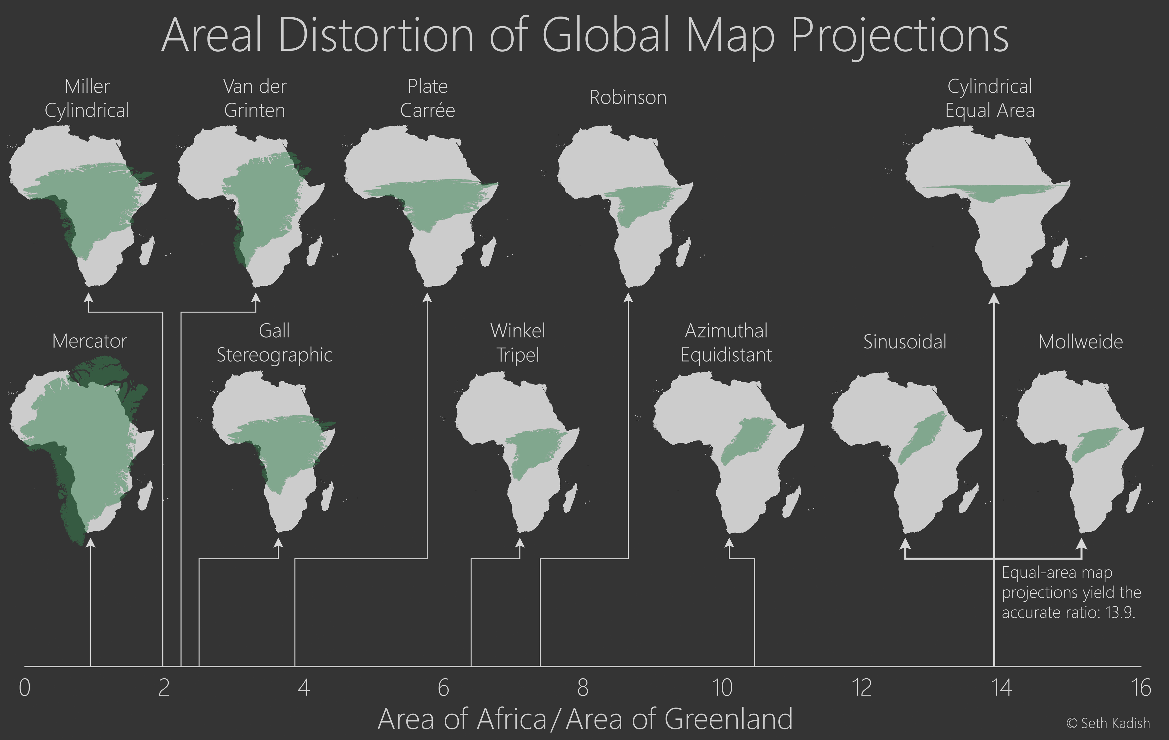
Mercator vs Sinusoidal projection (world map)

