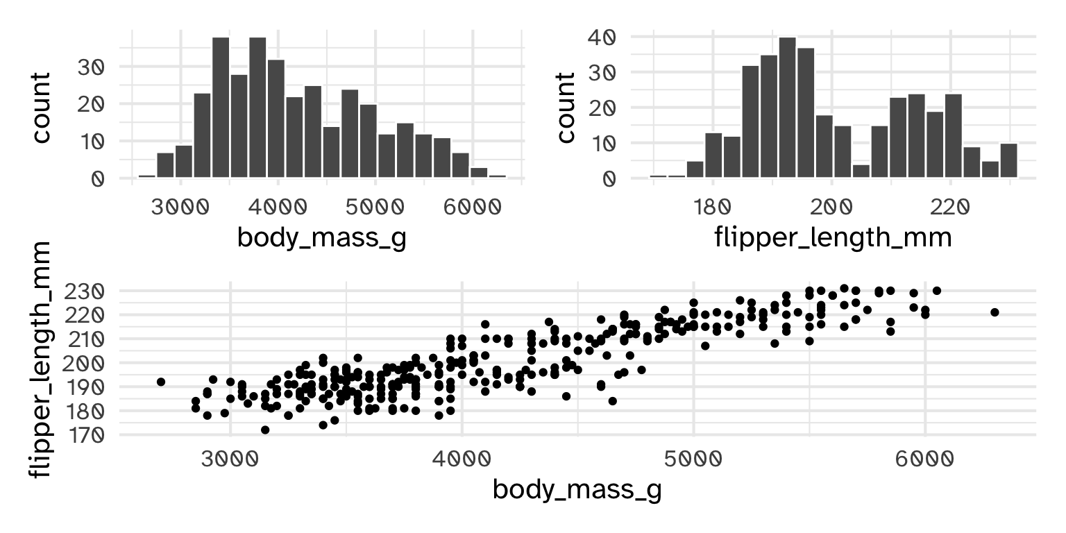
library(palmerpenguins)
ggplot(penguins) +
  geom_histogram(bins = 20, col = "white", aes(x = body_mass_g))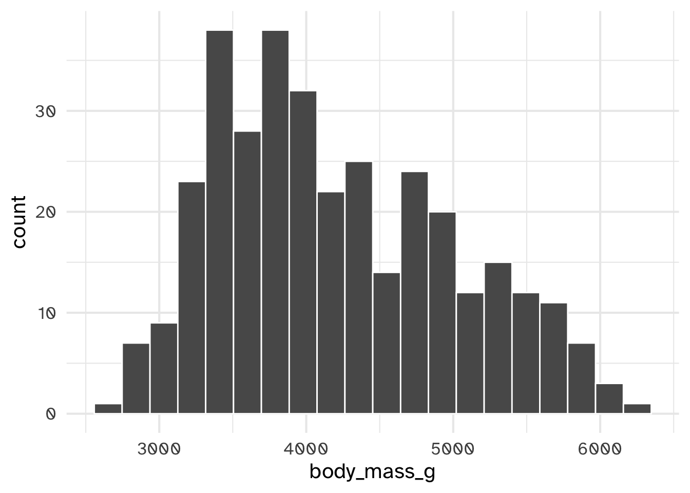
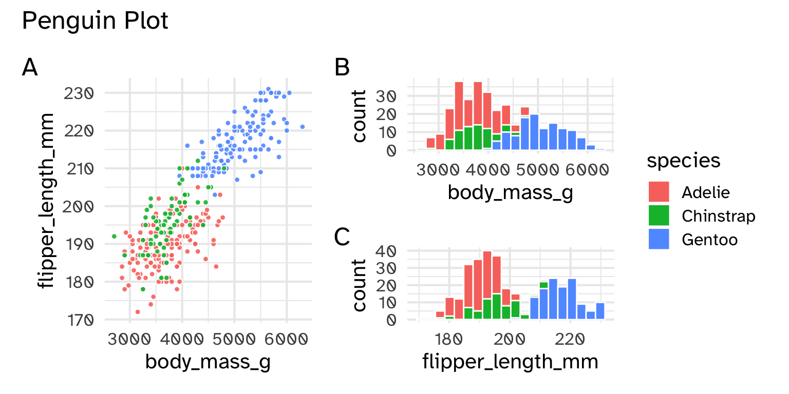
Day 06
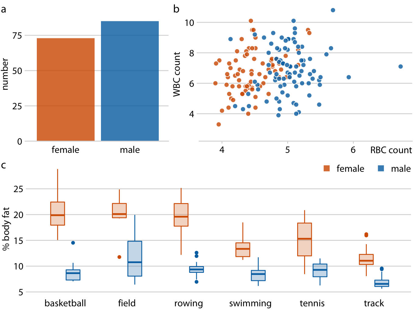
Each plot shares aesthetics but shows different subsets of data
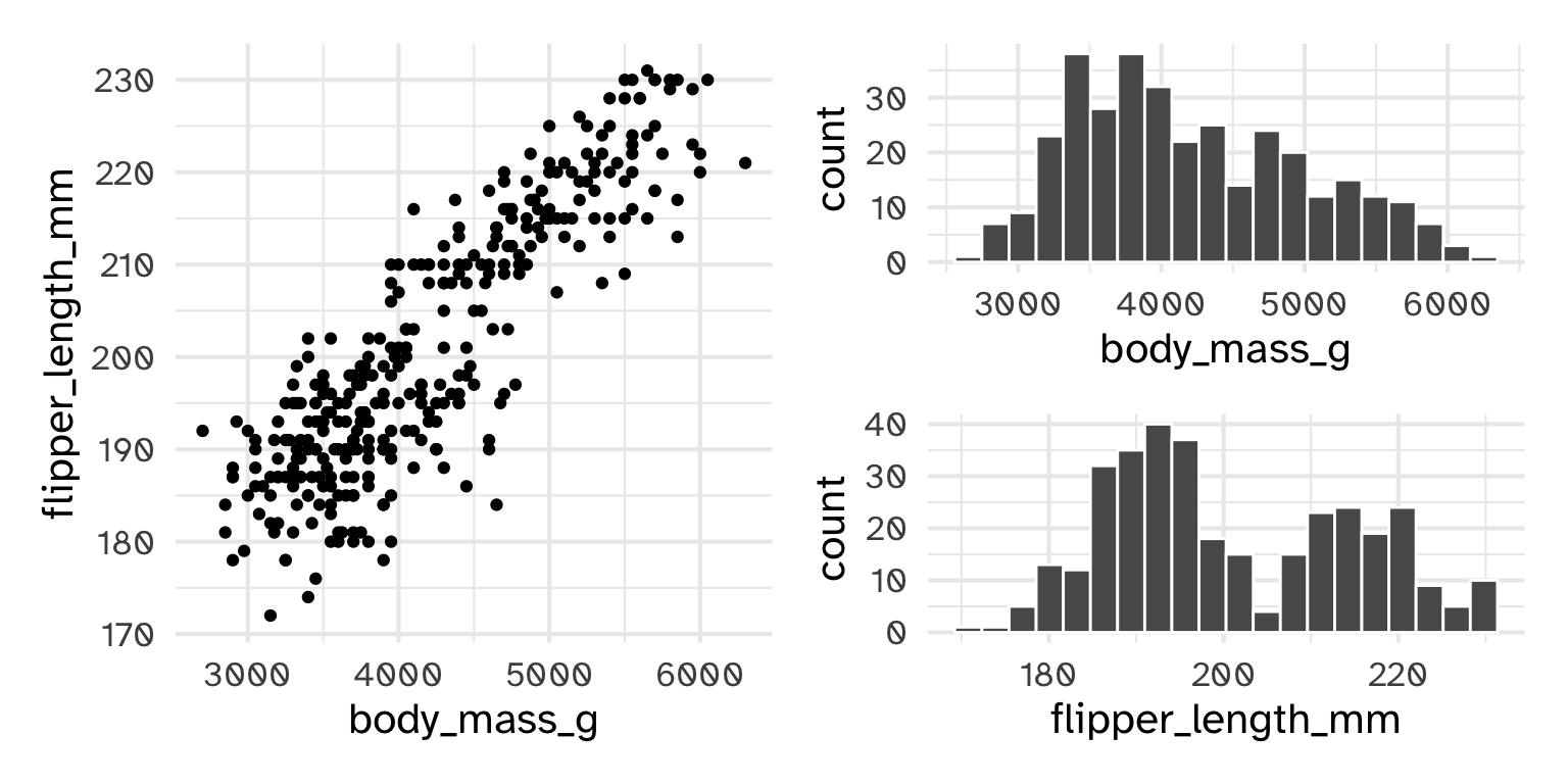
The plots might share data, but don’t share aesthetics
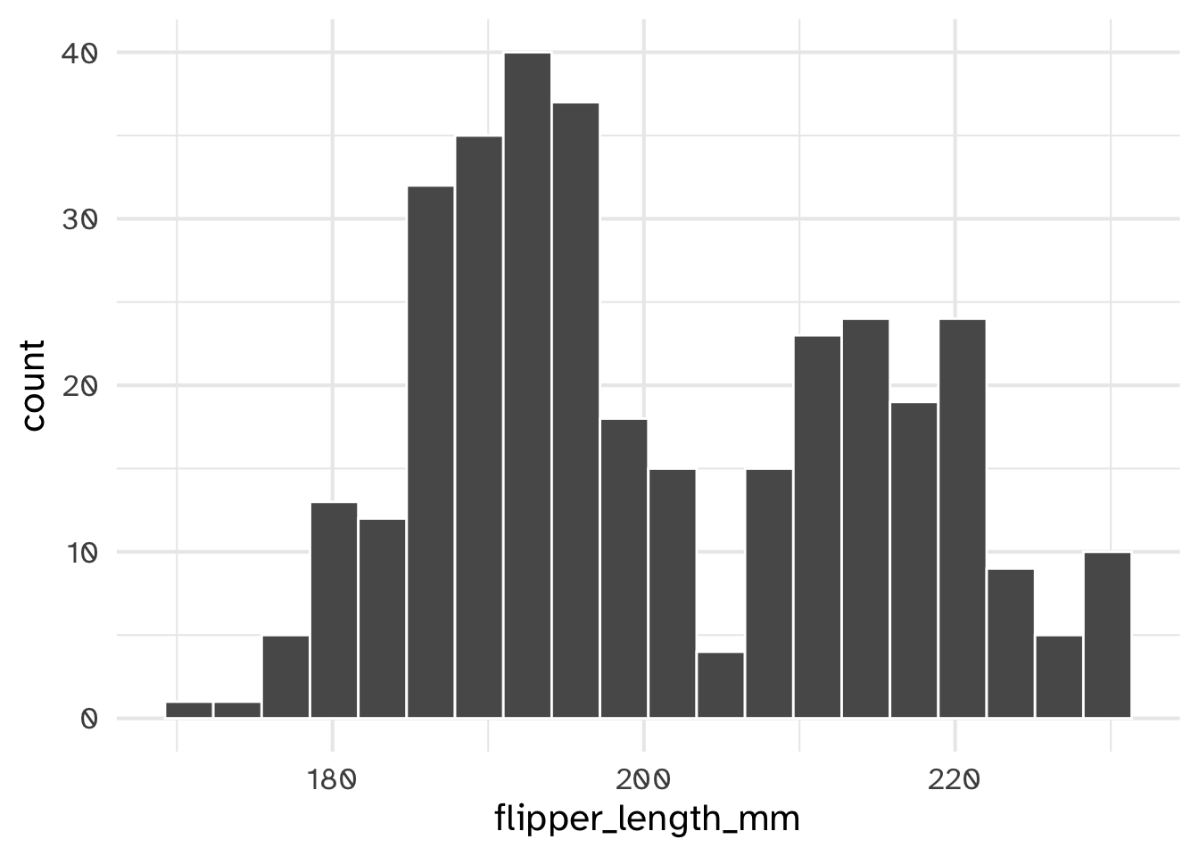
p1 <- ggplot(penguins) +
geom_histogram(bins = 20, col = "white", aes(x = body_mass_g, fill = species))
p2 <- ggplot(penguins) +
geom_histogram(bins = 20, col = "white", aes(x = flipper_length_mm, fill = species))
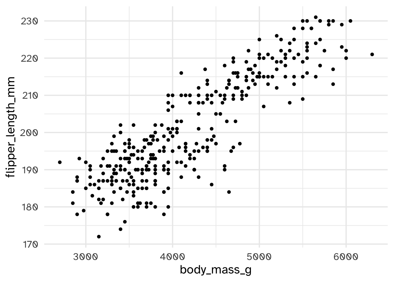
p3 <- ggplot(penguins) +
geom_point(shape = 21, alpha = .9, col = "white", aes(x = body_mass_g, y = flipper_length_mm, fill = species))
p3 + (p1/p2) 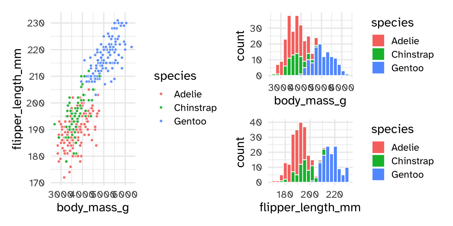
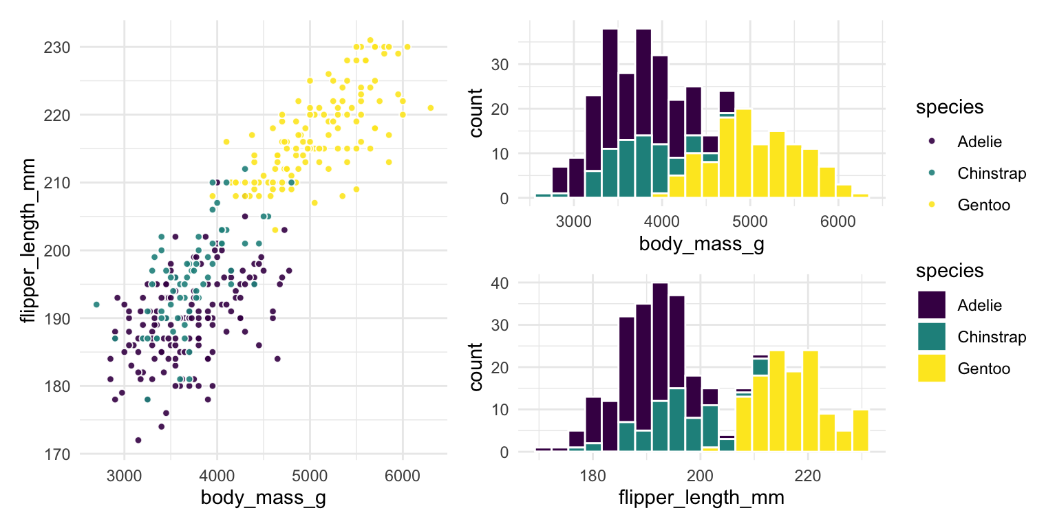
p1 <- ggplot(penguins) +
  geom_histogram(bins = 20, col = "white", aes(x = body_mass_g, fill = species))

p2 <- ggplot(penguins) +
  geom_histogram(bins = 20,  col = "white", aes(x = flipper_length_mm, fill = species))

p3 <- ggplot(penguins) +
  geom_point(shape = 21, alpha = .9, col = "white", aes(x = body_mass_g, y = flipper_length_mm, fill = species))

p3 + (p1/p2) +
  plot_layout(guides = 'collect')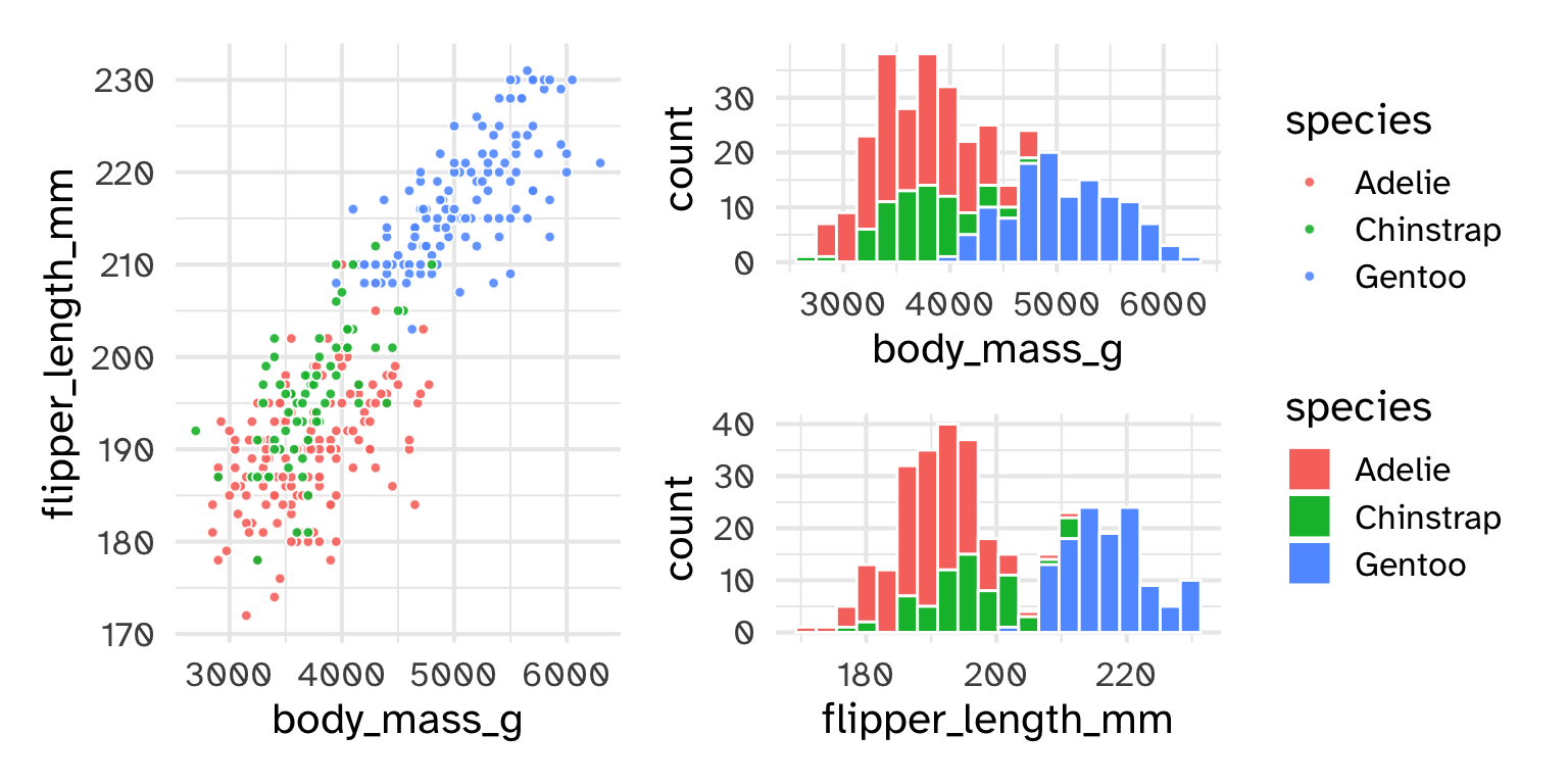
point legend)p1 <- ggplot(penguins) +
geom_histogram(bins = 20, col = "white", aes(x = body_mass_g, fill = species))
p2 <- ggplot(penguins) +
geom_histogram(bins = 20, col = "white", aes(x = flipper_length_mm, fill = species))
p3 <- ggplot(penguins) +
geom_point(shape = 21, alpha = .9, col = "white", aes(x = body_mass_g, y = flipper_length_mm, fill = species)) +
theme(legend.position = "none")
p3 + (p1/p2) +
plot_layout(guides = 'collect')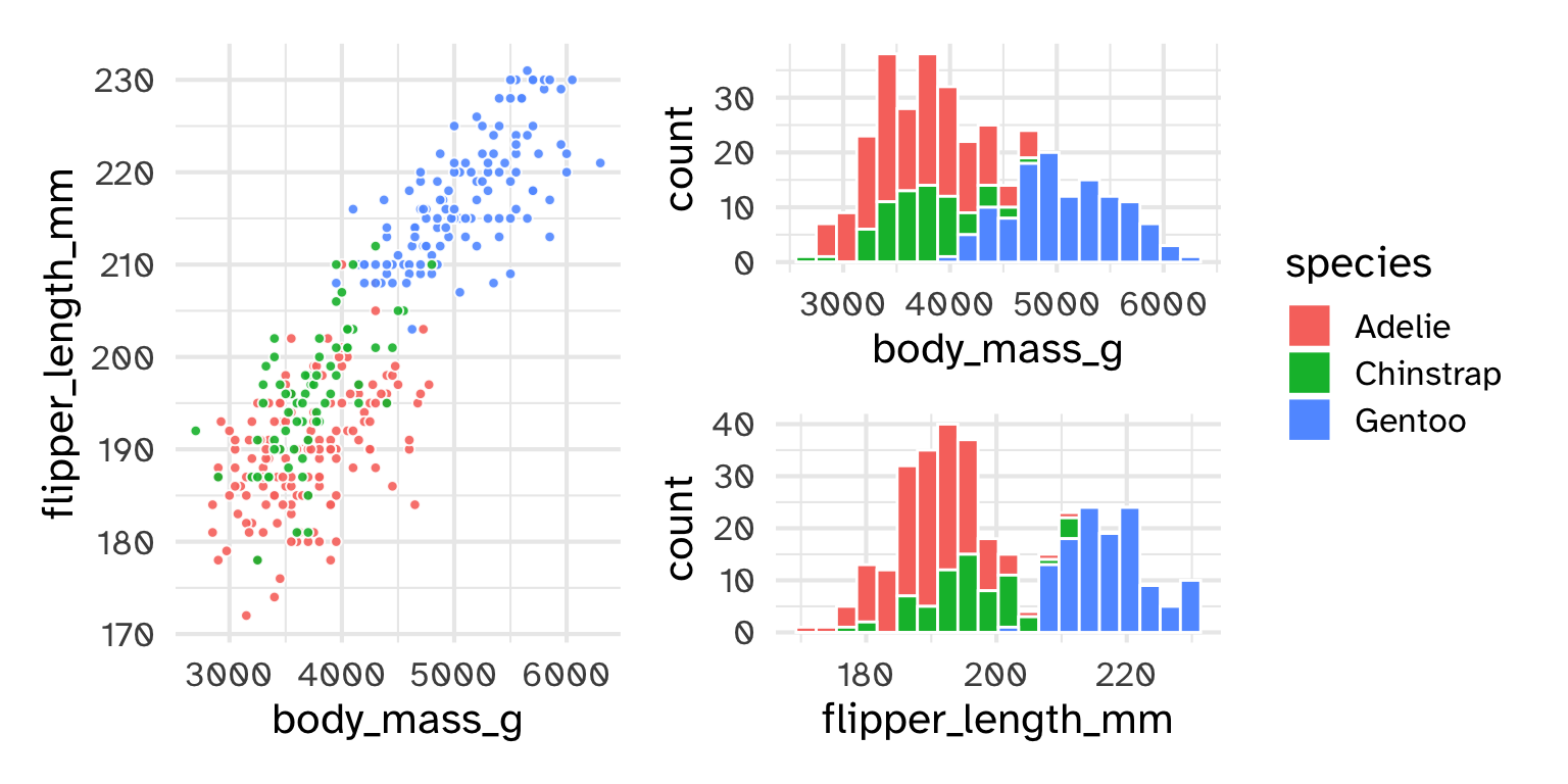
Categorical variables
Order doesn’t matter
Numeric variables
Order matters
Diverging variables
Midpoint matters
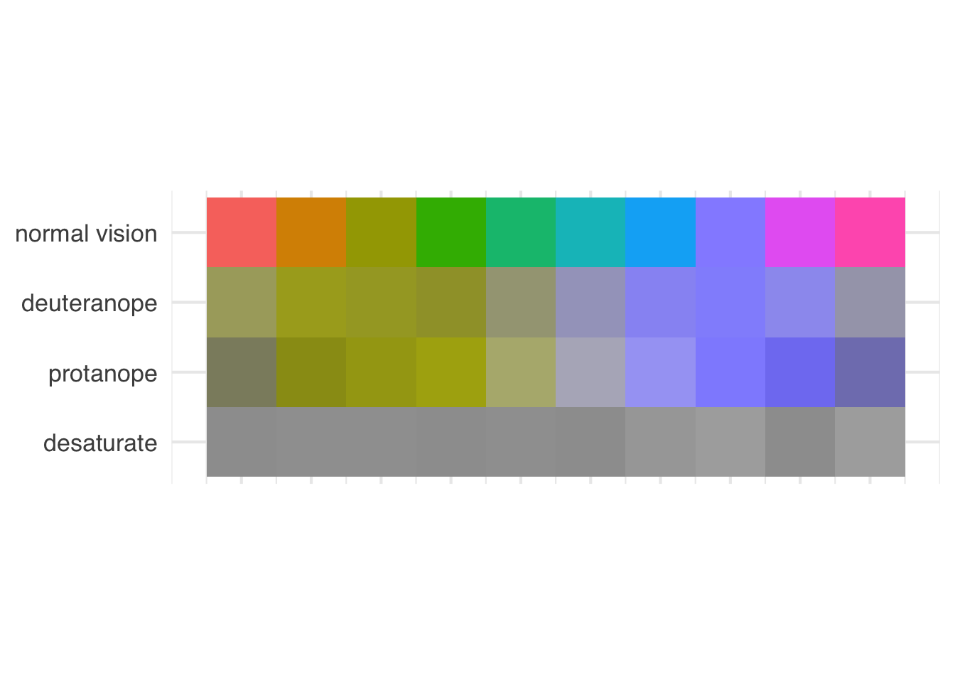
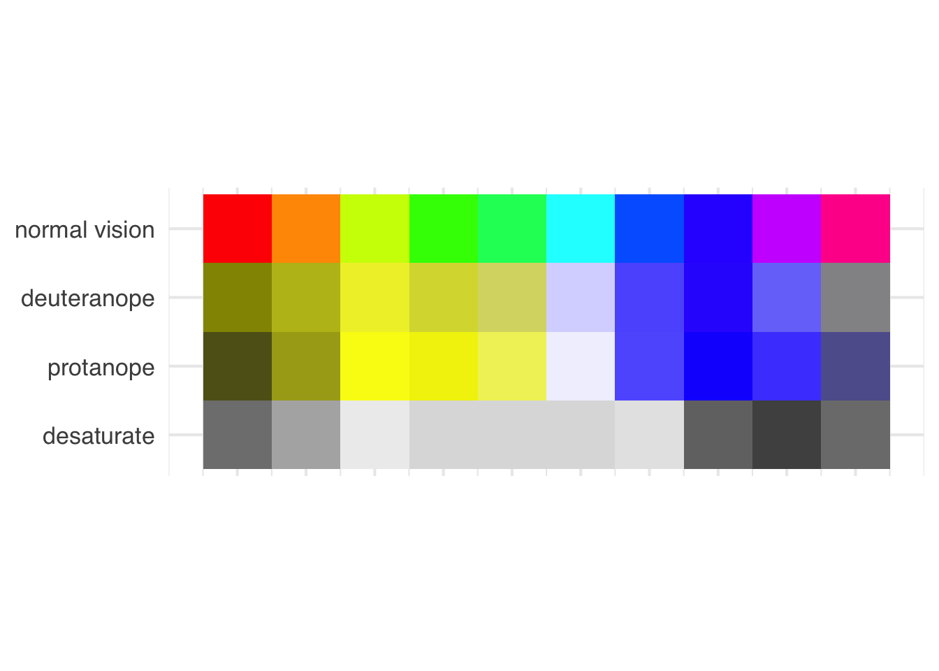
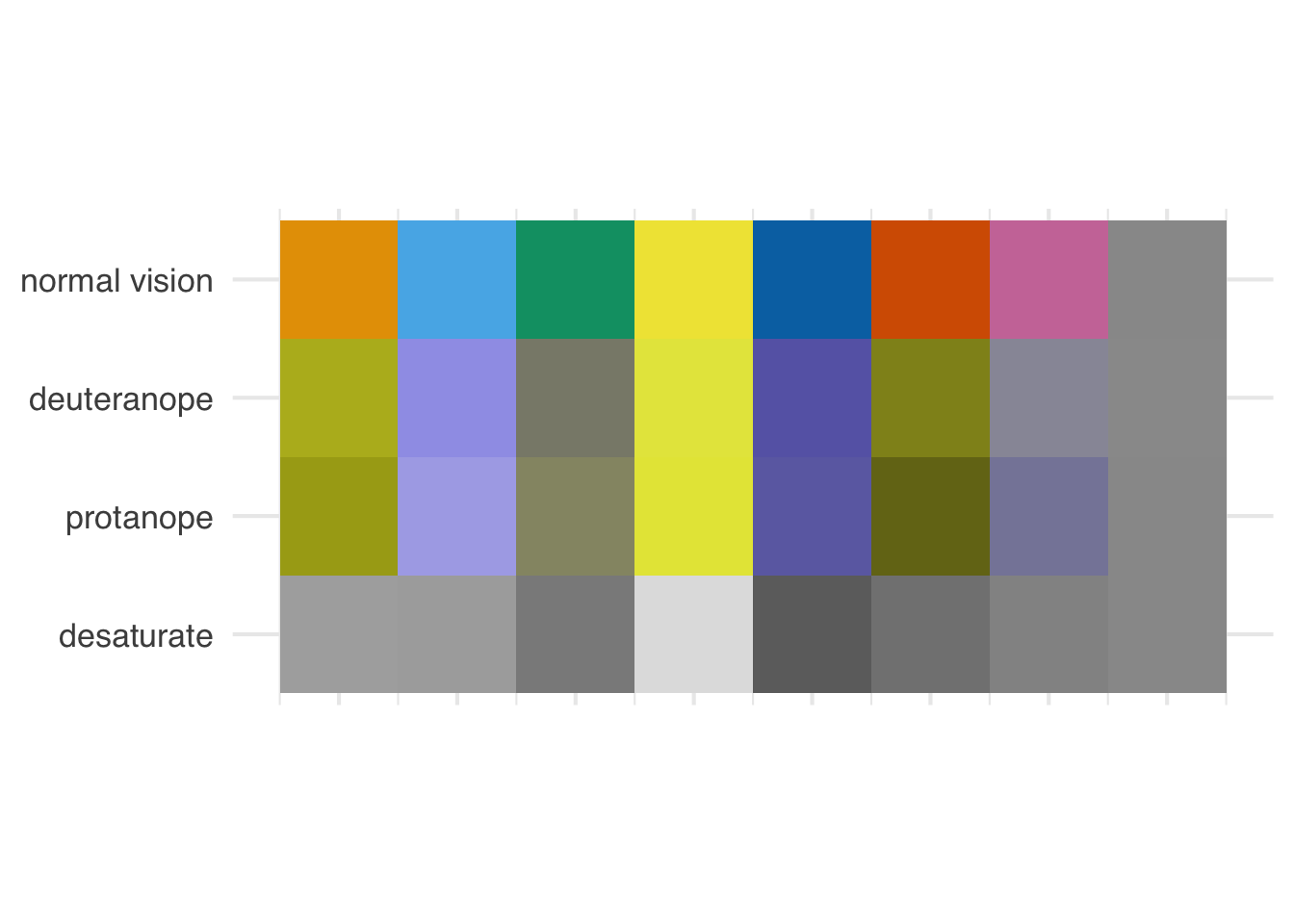
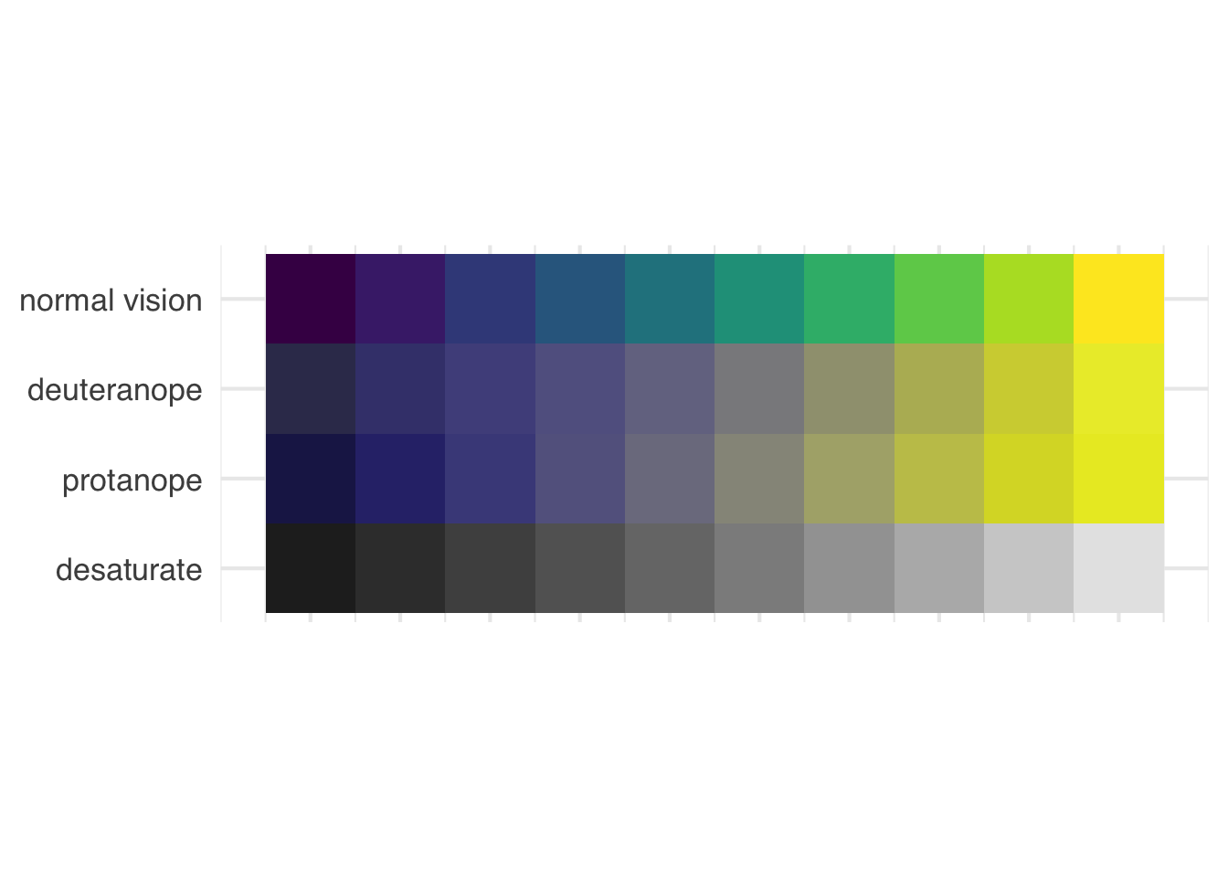
Use colorblind friendly color scales (e.g., Okabe Ito, viridis)

Use shape and color where possible
Default ggplot2 scale
Default ggplot2 scale with deuteranopia
Default ggplot2 scale
Default ggplot2 scale with deuteranopia
Default ggplot2 scale
Default ggplot2 scale with deuteranopia
Default ggplot2 scale

Default ggplot2 scale with tritanopia
Default ggplot2 scale
Default ggplot2 scale with tritanopia
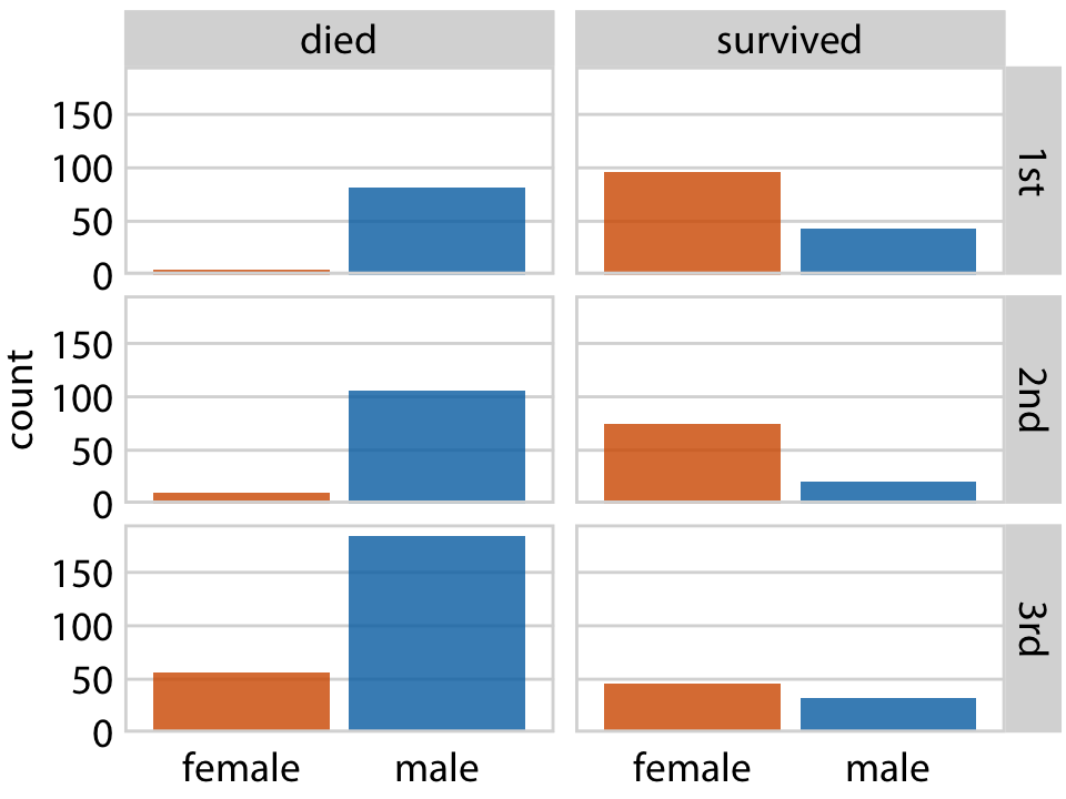
CHART TYPE of TYPE OF DATA where REASON FOR INCLUDING CHART
01:30
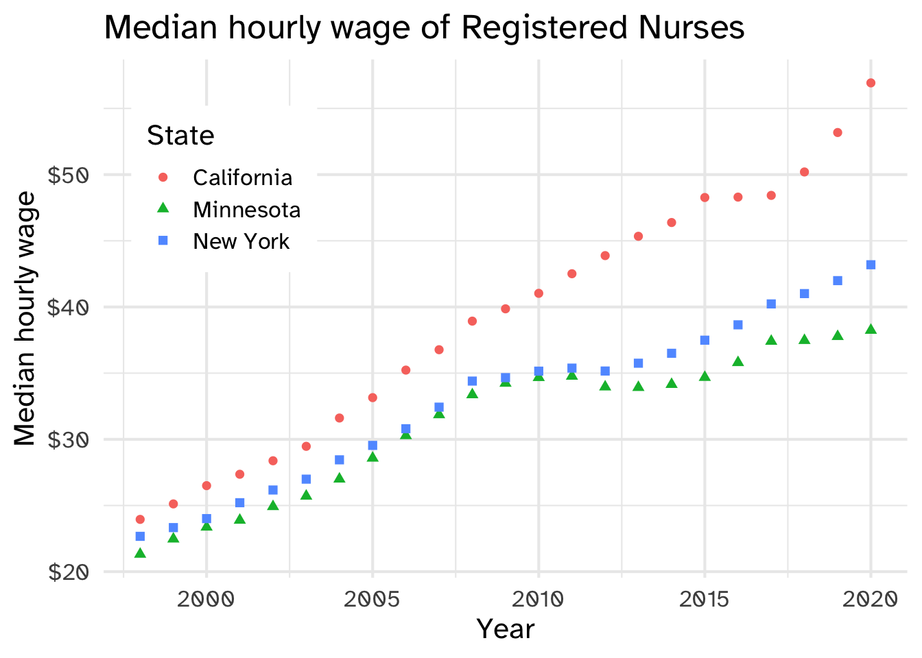
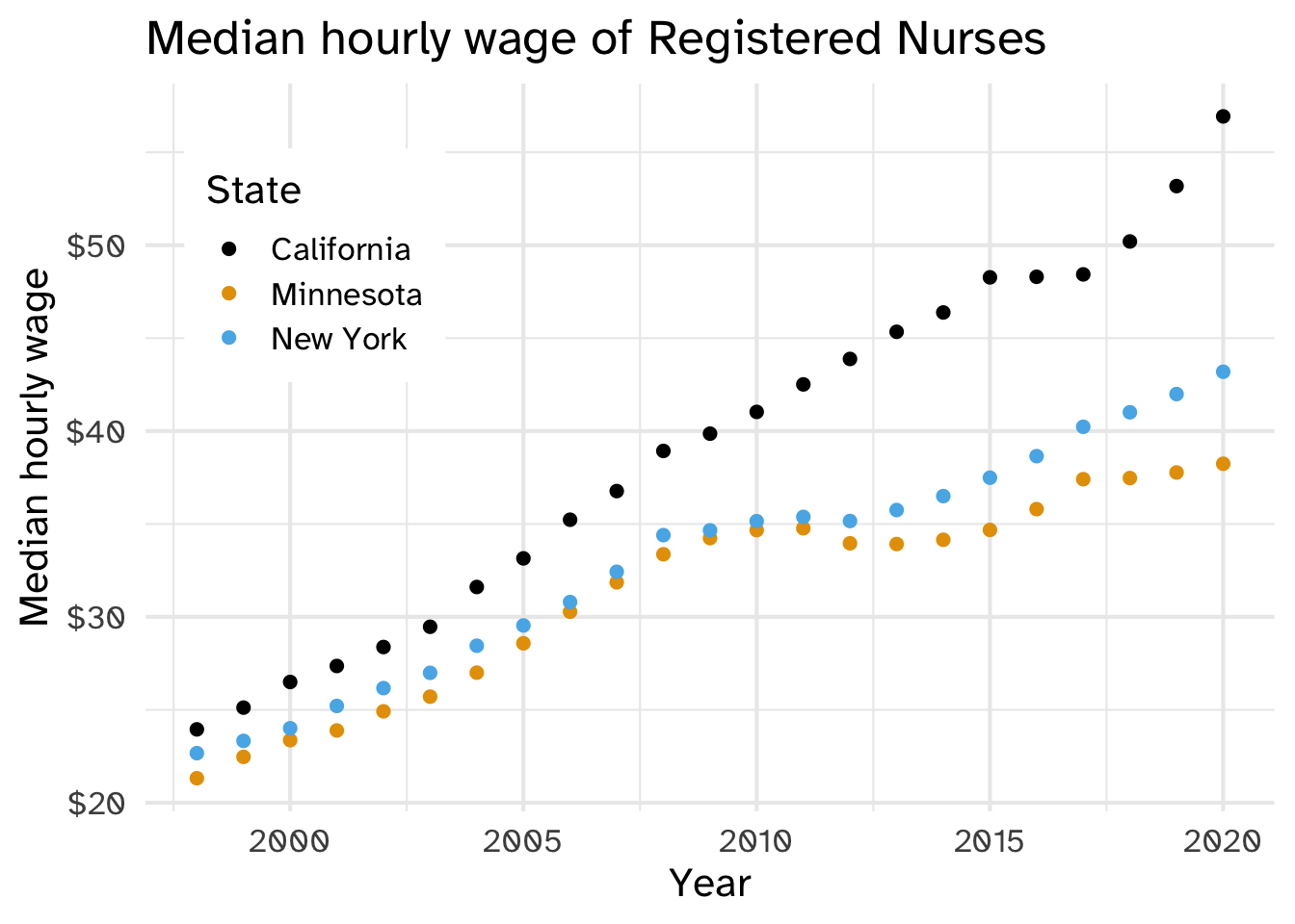
nurses_subset |>
  ggplot(aes(x = year, y = hourly_wage_median, color = state)) +
  geom_point(size = 2) +
  ggthemes::scale_color_colorblind() +
  scale_y_continuous(labels = scales::label_dollar()) +
  labs(
    x = "Year", y = "Median hourly wage", color = "State",
    title = "Median hourly wage of Registered Nurses"
  ) +
  theme(
    legend.position = c(0.15, 0.75),
    legend.background = element_rect(fill = "white", color = "white")
  )
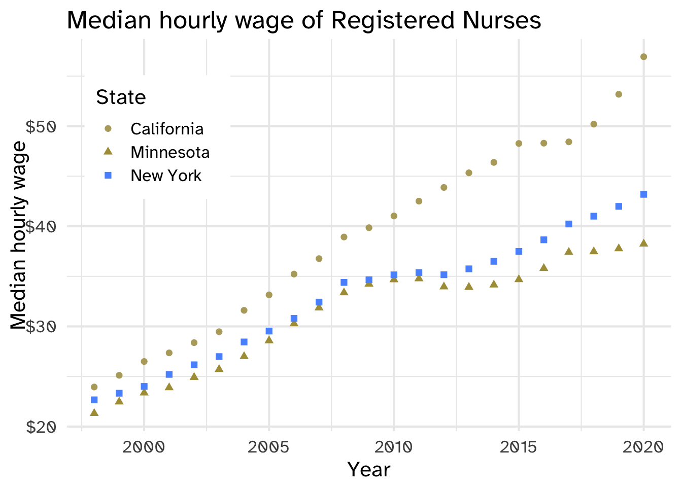
Use both color and shape aesthetics
nurses_subset |>
  ggplot(aes(x = year, y = hourly_wage_median, color = state, shape = state)) +
  geom_point(size = 2) +
  scale_y_continuous(labels = scales::label_dollar()) +
  labs(
    x = "Year", y = "Median hourly wage", color = "State", shape = "State",
    title = "Median hourly wage of Registered Nurses"
  ) +
  theme(
    legend.position = c(0.15, 0.75),
    legend.background = element_rect(fill = "white", color = "white")
    )
Could do “by hand” with annotate(). Alternatively, use geom_text()
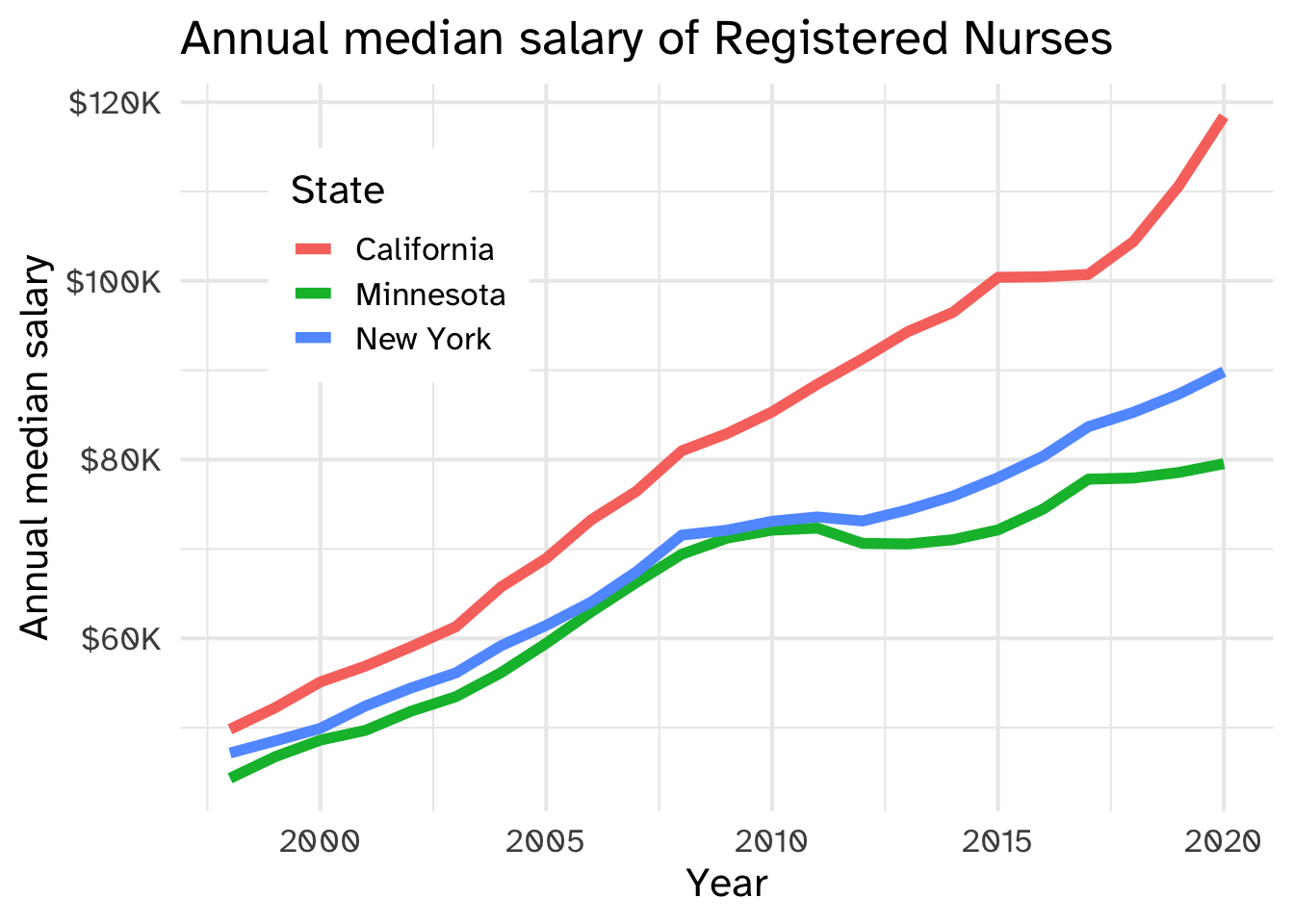
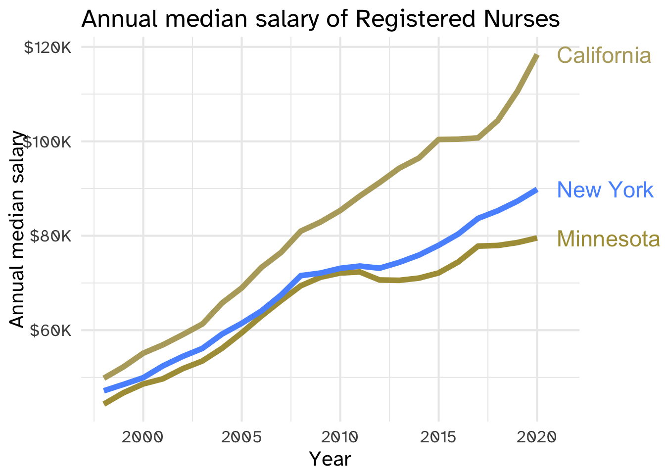
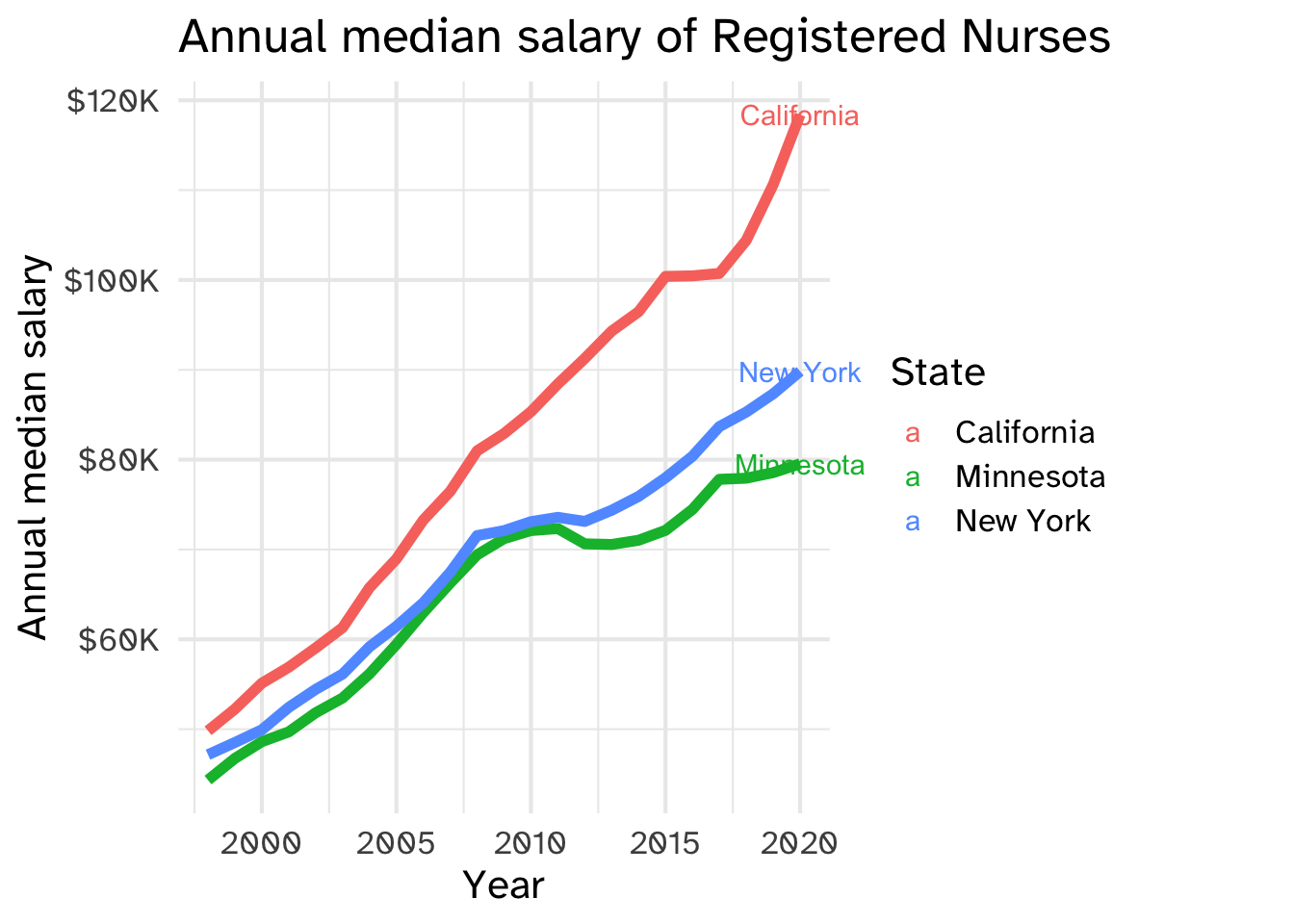
nurses_subset |>
  ggplot(aes(x = year, y = annual_salary_median, color = state)) +
  geom_line(show.legend = FALSE, linewidth = 2) +
  geom_text(
    data = nurses_subset |> filter(year == max(year)),
    aes(label = state), hjust = 0, nudge_x = 1,
    show.legend = FALSE, size = 6
  ) +
  scale_y_continuous(labels = scales::label_dollar(scale = 1/1000, suffix = "K")) +
  labs(
    x = "Year", y = "Annual median salary", color = "State",
    title = "Annual median salary of Registered Nurses"
  ) +
  coord_cartesian(clip = "off") +
  theme(
    plot.margin = margin(0.1, 0.9, 0.1, 0.1, "in")
    )
First, filter the data to include the endpoints only. Use the label aesthetic to map to the label in your data (in this case, state). geom_label by default will use the x and y aesthetics defined in ggplot()
nurses_subset |>
  ggplot(aes(x = year, y = annual_salary_median, color = state)) +
  geom_line(show.legend = FALSE, linewidth = 2) +
  geom_text(
    data = nurses_subset |> filter(year == max(year)),
    aes(label = state)
  ) +
  scale_y_continuous(labels = scales::label_dollar(scale = 1/1000, suffix = "K")) +
  labs(
    x = "Year", y = "Annual median salary", color = "State",
    title = "Annual median salary of Registered Nurses"
  ) +
  coord_cartesian(clip = "off") +
  theme(
    plot.margin = margin(0.1, 0.9, 0.1, 0.1, "in")
    )
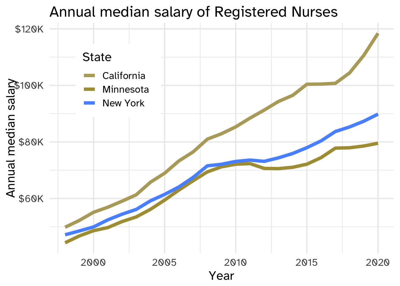
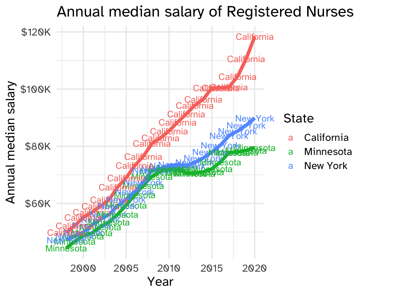
(Here’s what it looks like if we don’t filter to the endpoints)
nurses_subset |>
  ggplot(aes(x = year, y = annual_salary_median, color = state)) +
  geom_line(show.legend = FALSE, linewidth = 2) +
  geom_text(
    aes(label = state)
  ) +
  scale_y_continuous(labels = scales::label_dollar(scale = 1/1000, suffix = "K")) +
  labs(
    x = "Year", y = "Annual median salary", color = "State",
    title = "Annual median salary of Registered Nurses"
  ) +
  coord_cartesian(clip = "off") +
  theme(
    plot.margin = margin(0.1, 0.9, 0.1, 0.1, "in")
    )
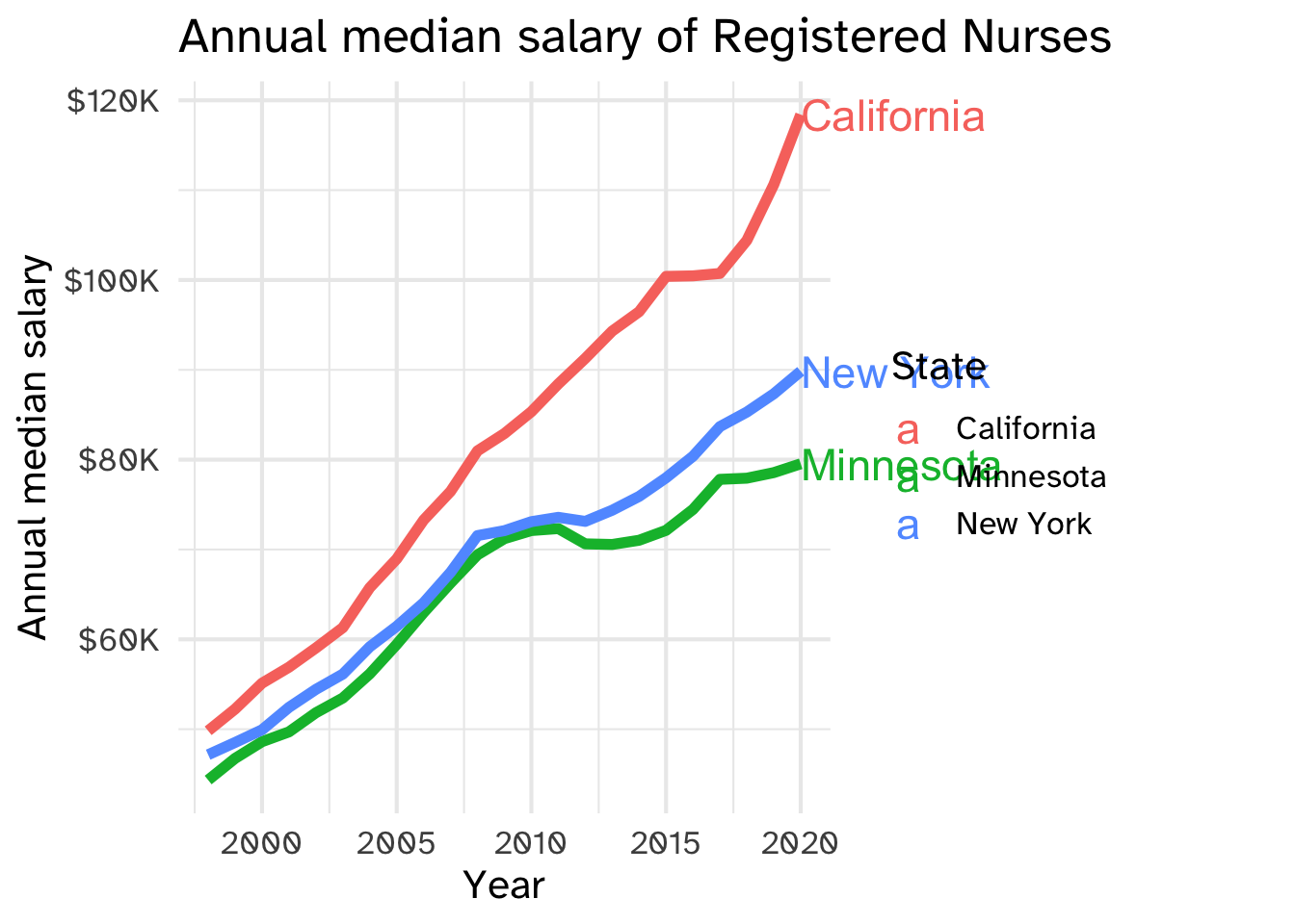
hjust=0 means “left justified”, or make the label start at the x-y coordinate you gave it. size = 6 makes the label bigger
nurses_subset |>
  ggplot(aes(x = year, y = annual_salary_median, color = state)) +
  geom_line(show.legend = FALSE, linewidth = 2) +
  geom_text(
    data = nurses_subset |> filter(year == max(year)),
    aes(label = state),
    hjust = 0,
    size = 6
  ) +
  scale_y_continuous(labels = scales::label_dollar(scale = 1/1000, suffix = "K")) +
  labs(
    x = "Year", y = "Annual median salary", color = "State",
    title = "Annual median salary of Registered Nurses"
  ) +
  coord_cartesian(clip = "off") +
  theme(
    plot.margin = margin(0.1, 0.9, 0.1, 0.1, "in")
    )
nudge_x = 1 “nudges” each label one unit in the x-direction (so each label is a small distance away from what it’s labeling). show.legend=FALSE tells ggplot not to include the aesthetics for geom_text in the legend
nurses_subset |>
  ggplot(aes(x = year, y = annual_salary_median, color = state)) +
  geom_line(show.legend = FALSE, linewidth = 2) +
  geom_text(
    data = nurses_subset |> filter(year == max(year)),
    aes(label = state),
    hjust = 0,
    size = 6,
    nudge_x = 1,
    show.legend = FALSE,
  ) +
  scale_y_continuous(labels = scales::label_dollar(scale = 1/1000, suffix = "K")) +
  labs(
    x = "Year", y = "Annual median salary", color = "State",
    title = "Annual median salary of Registered Nurses"
  ) +
  coord_cartesian(clip = "off") +
  theme(
    plot.margin = margin(0.1, 0.9, 0.1, 0.1, "in")
    )
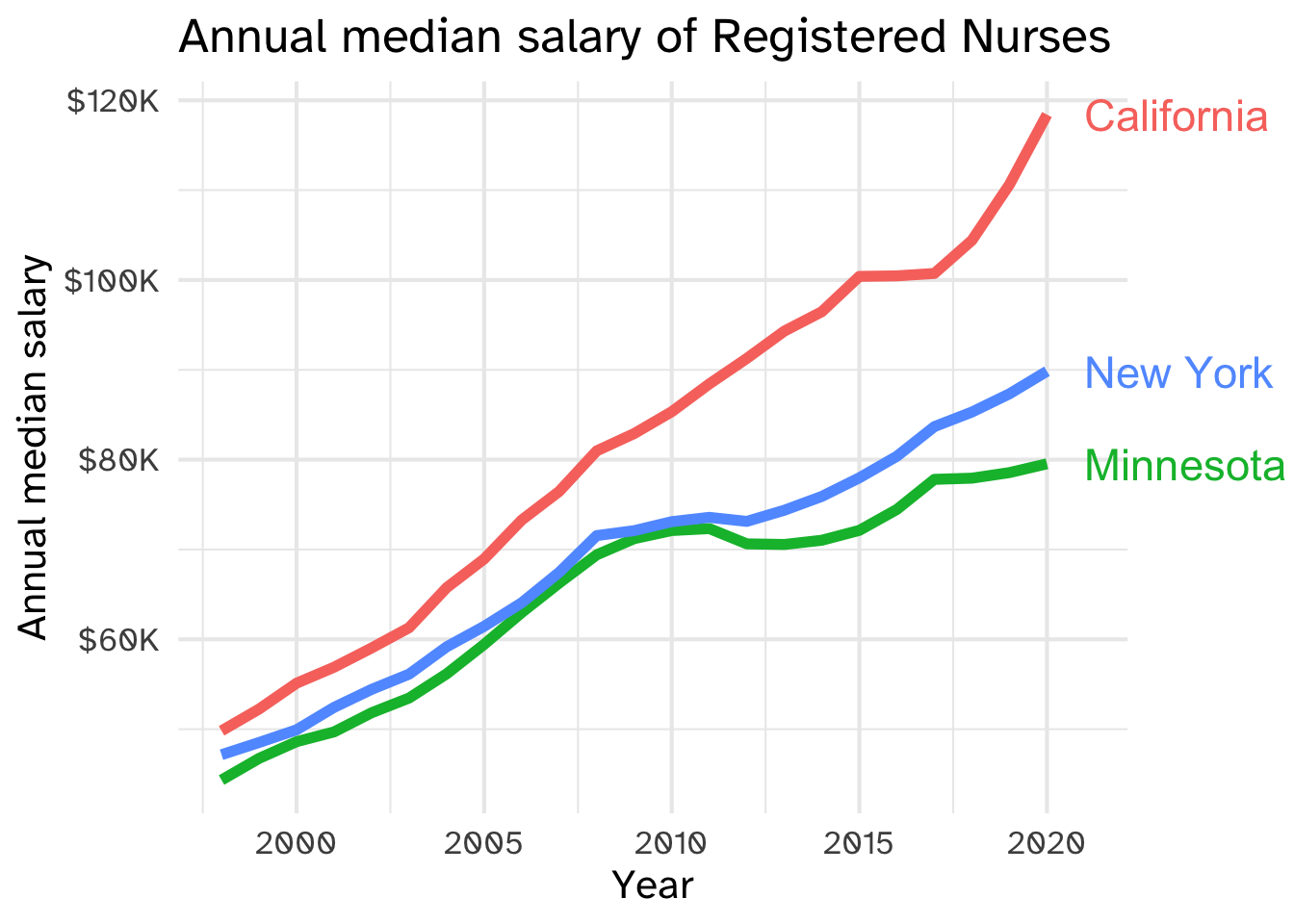
Finally, we have to tell ggplot not to trim the plot, and leave room in the right margin for the labels themselves
nurses_subset |>
  ggplot(aes(x = year, y = annual_salary_median, color = state)) +
  geom_line(show.legend = FALSE, linewidth = 2) +
  geom_text(
    data = nurses_subset |> filter(year == max(year)),
    aes(label = state),
    hjust = 0,
    size = 6,
    nudge_x = 1,
    show.legend = FALSE,
  ) +
  scale_y_continuous(labels = scales::label_dollar(scale = 1/1000, suffix = "K")) +
  labs(
    x = "Year", y = "Annual median salary", color = "State",
    title = "Annual median salary of Registered Nurses"
  ) +
  coord_cartesian(clip = "off") +
  theme(
    plot.margin = margin(0.1, 0.9, 0.1, 0.1, "in")
    )
Set the color aesthetic to white
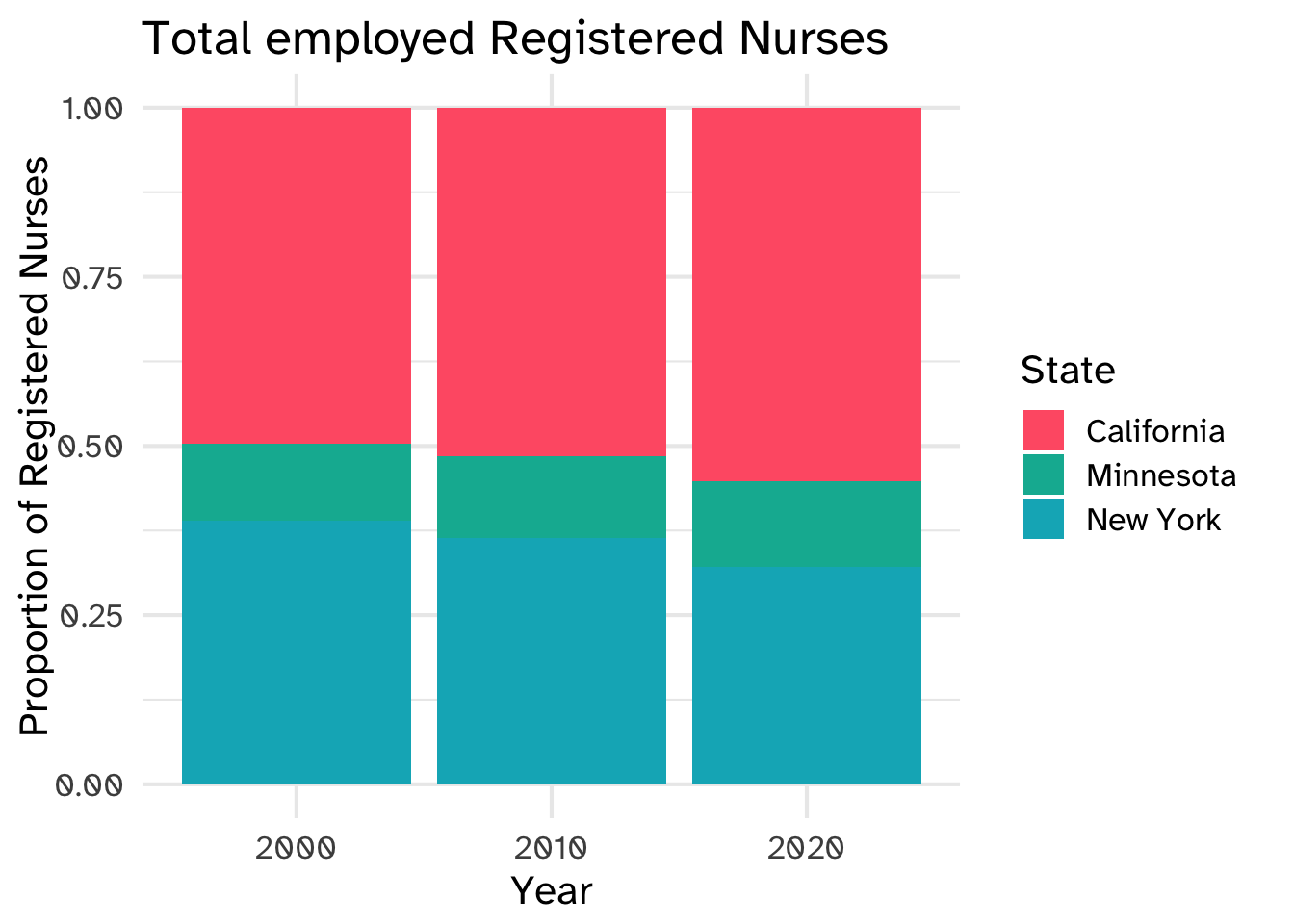
nurses_subset |>
  filter(year %in% c(2000, 2010, 2020)) |>
  ggplot(aes(x = factor(year), y = total_employed_rn, fill = state)) +
  geom_col(position = "fill", color = "white", linewidth = 1) +
  labs(
    x = "Year", y = "Proportion of Registered Nurses", fill = "State",
    title = "Total employed Registered Nurses"
  )