Intro to
Interactivity
in R
Day 22
rmarkdown outputs: pdf
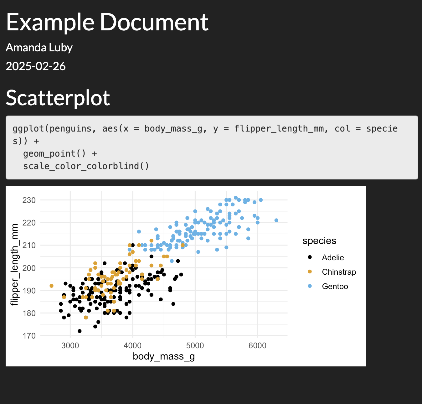
rmarkdown outputs: html
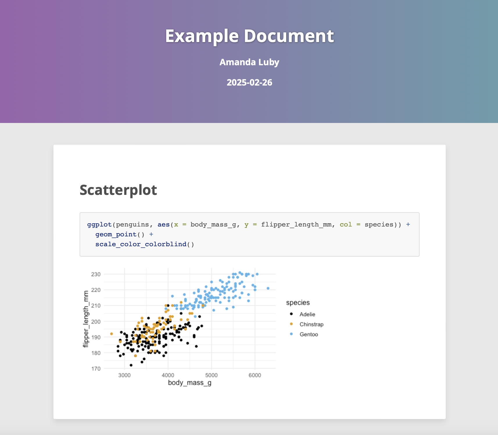
rmarkdown outputs: html, custom theme
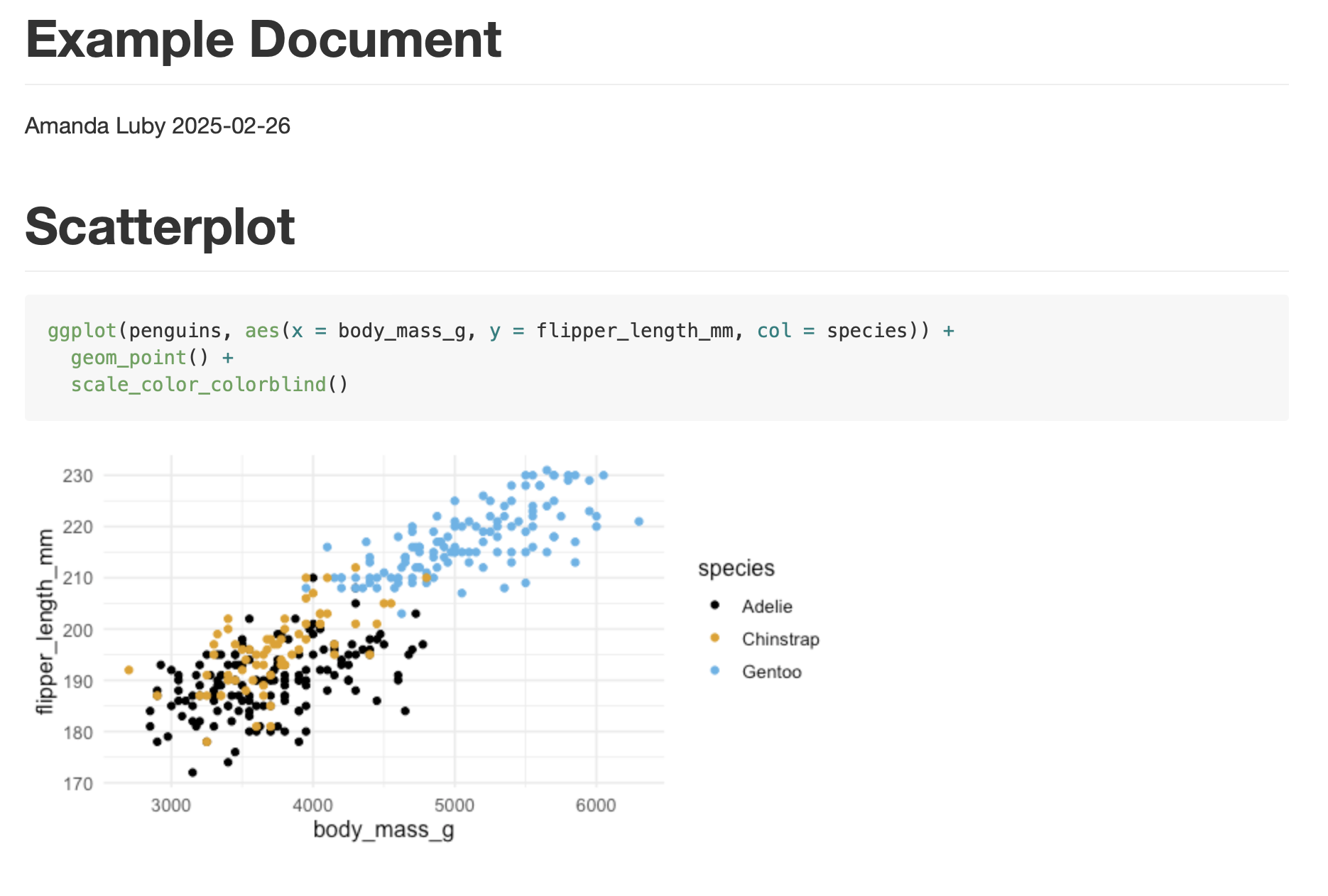
rmarkdown outputs: github-flavored markdown
rmarkdown outputs: html theme in a package
Dashboards
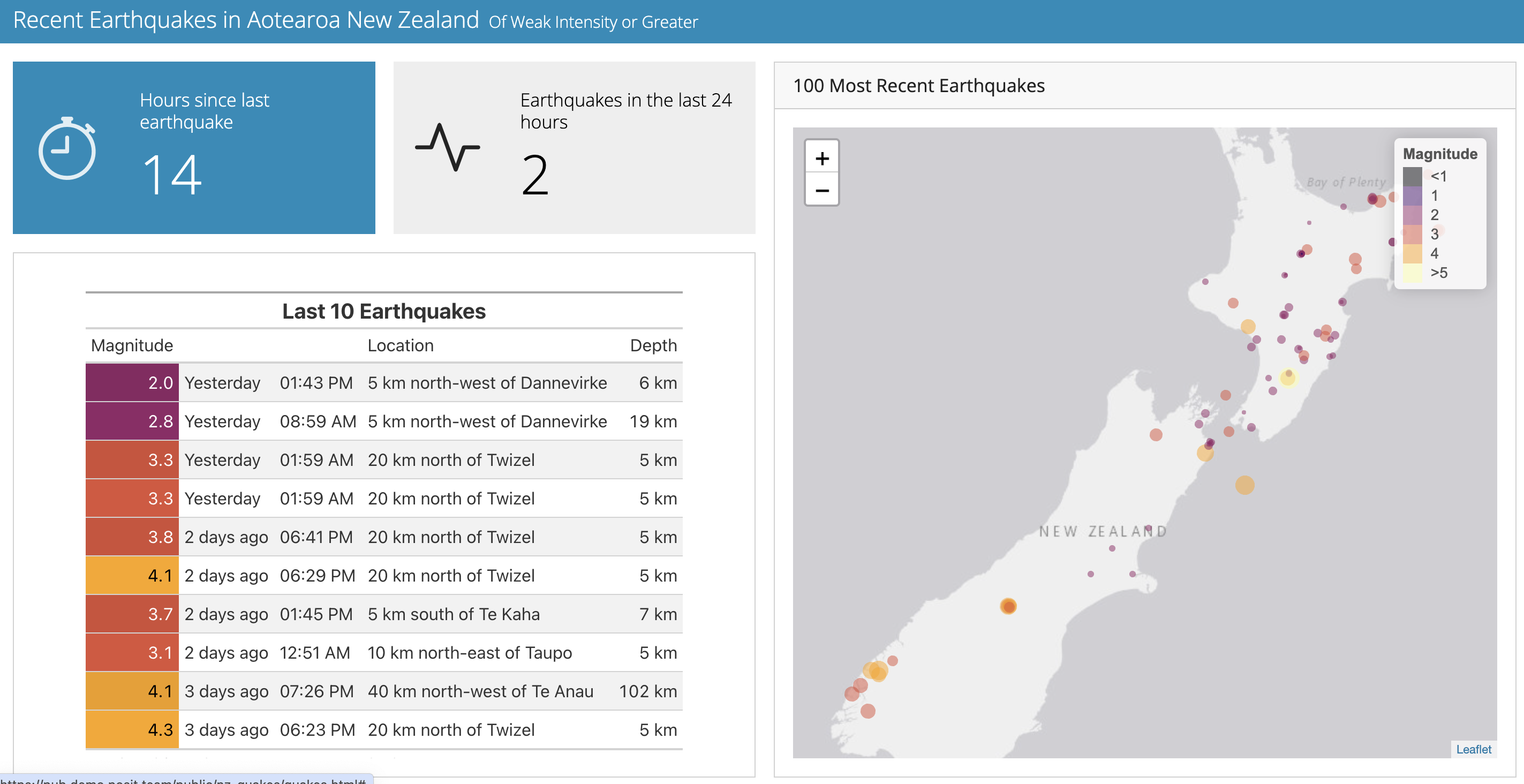
Navigation bar and pages
---
title: "Palmer Penguins"
author: "Amanda Luby"
output:
flexdashboard::flex_dashboard:
orientation: columns
vertical_layout: fill
navbar:
- { title: "Data Source", href: "https://allisonhorst.github.io/palmerpenguins/", align: right }
---
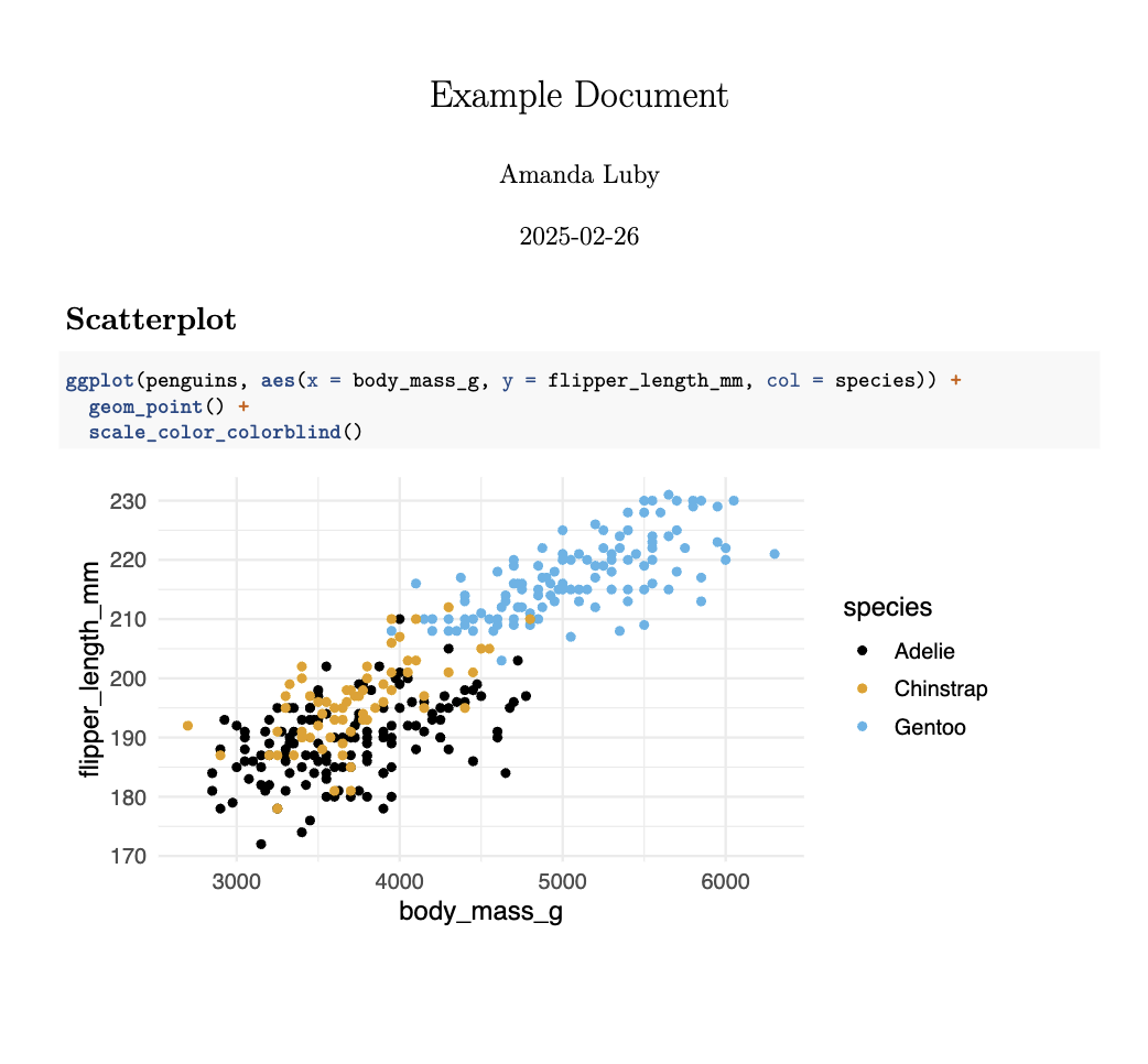
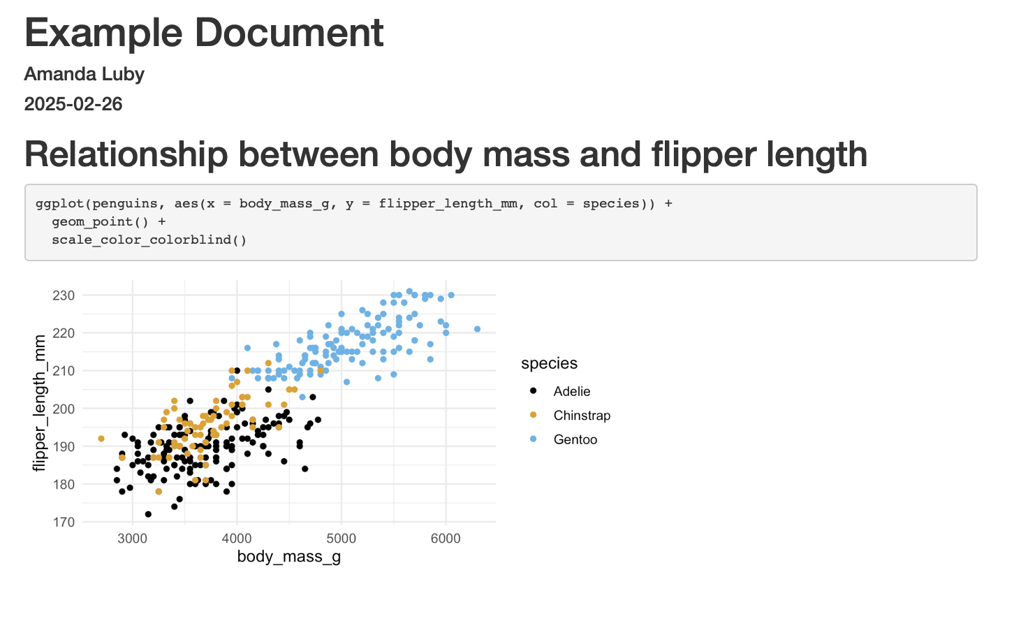
Graphs
=====================================
Data
===================================== 
Rows and columns
Graphs
=====================================
Column {data-width=650}
-----------------------------------------------------------------------
### Chart 1
Column {data-width=350}
-----------------------------------------------------------------------
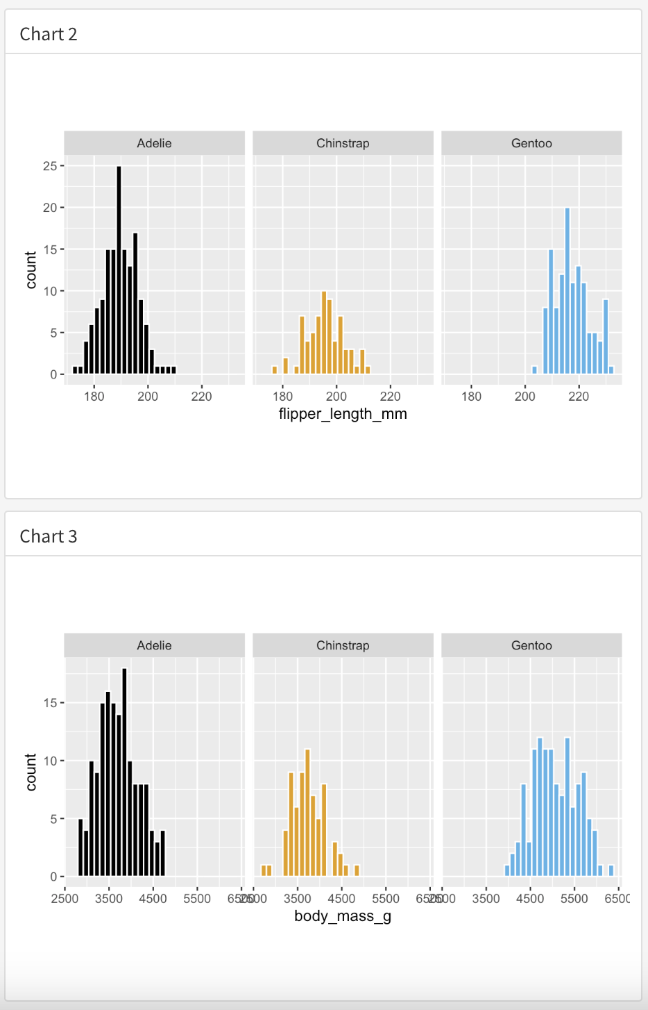
### Chart 2
### Chart 3
Sections
Column {data-width=350}
-----------------------------------------------------------------------

### Chart 2

### Chart 3